“Breathe” a Walking In the Forest Layout

0

Posted by Gabrielle Pollacco

16 December, 2015 - , ,

Write a comment

Breath_GabriellePollacco_Maja_resized

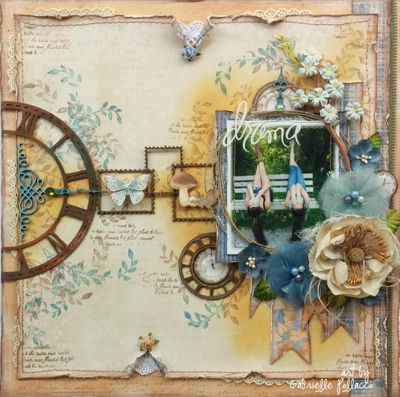
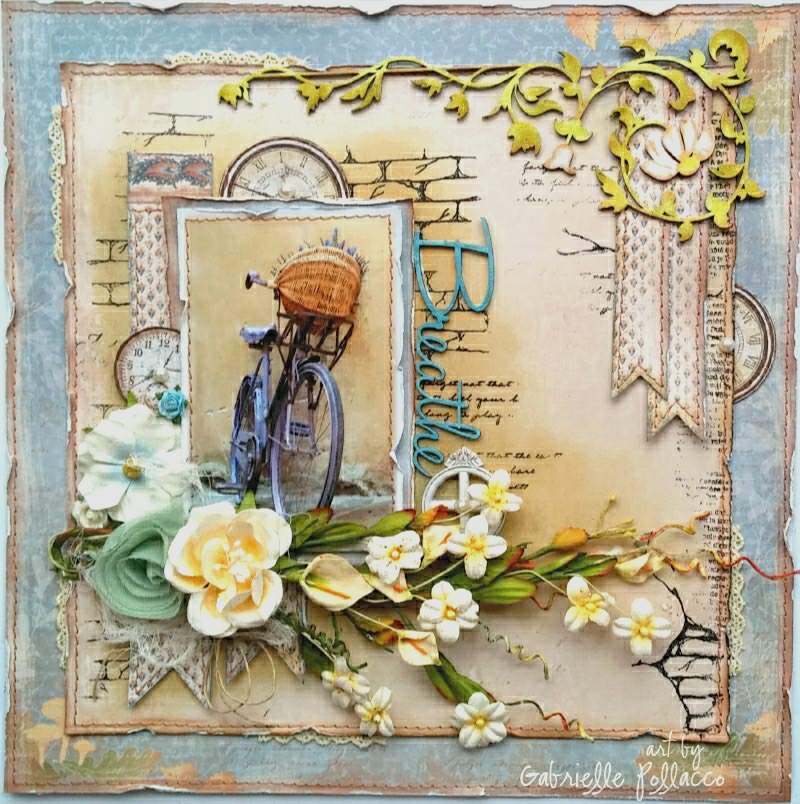
Hi everyone!  It’s Gabrielle here with you today to share a layout I made using the happy sunny, Maja Design “Walking in the Forest” collection, as well as some clock images cut from the Vintage Autumn Basics paper collection.

Walking-in-the-forest-P

I used the following papers:  Walking in the Forest (Autumn Poem, Flannel Shirt-bs, Cozy Scarf-bs), Vintage Autumn Basics (XVI)….love this paper for it’s lovely clock accents!

Breath_GabriellePollacco_Maja_close1

I used the Autumn Poem paper as my background matting paper and then cut the backside of the ‘Flannel Shirt’ paper to leave about an inch around the outside of the paper.  I inked the background with some Tim Holtz ‘Antique Linen’ Distress ink around the photo area using a sponge applicator.  I then did a little stamping with a couple of stamps I designed for The Scrapbook Diaries (brick stamp from my textures set and some script from my Labels stamp set).

Breath_GabriellePollacco_Maja_close2

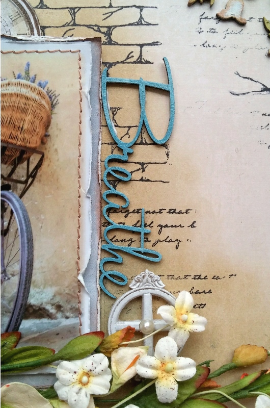
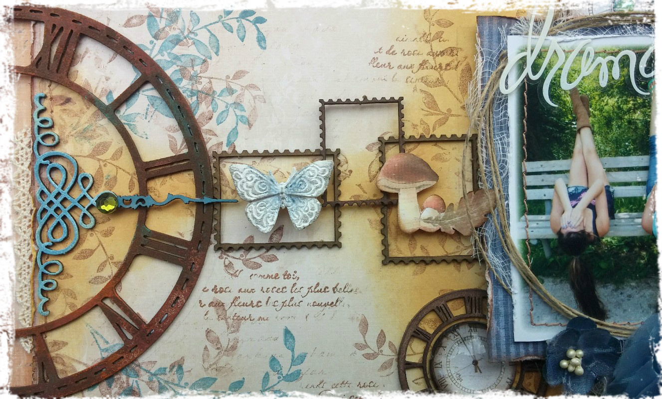
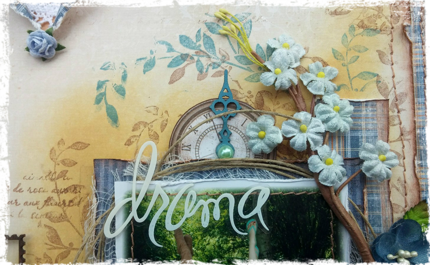
The title is from a Dusty Attic word pack #10.  I gave all my chipboard a coat of white Gesso (I like to do this so that when I ink them, the colors show up brighter).  I then inked the chipboard with a Denim Distress Ink.

Breath_GabriellePollacco_Maja_close3

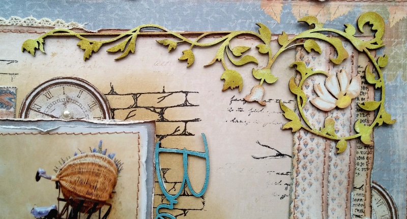
I used the Dusty Attic ‘Leafy Scroll’ chipboard design for my corner accent.  Again I painted it white with Gesso and then just randomly inked the leaves with Ingvild Bolme ‘Rock Moss’ chalk ink and edging with some Ingvild Bolme ‘Branch Bark’ chalk ink.

Breath_GabriellePollacco_Maja_close4

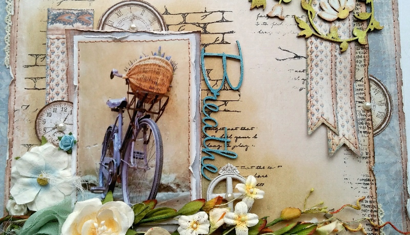
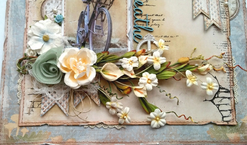
I cut banner strips from the backside of the Cozy Scarf paper and layered a few under the corner vine as well as under the photo area.

Do you ever have a page where you thoroughly enjoy working on it?  This is one of those layouts for me….the colors make me happy and every piece just seemed to work.  I hope you enjoyed my project today and hope I’ve inspired you to have a little ‘me’ time and scrap with your favorite Maja Design papers! xo

Gabrielle-sign


Home Decor ~ Door Hanger

0

Posted by Gabrielle Pollacco

2 December, 2015 - , , ,

Write a comment

Maja Door Hanger

Hi everyone! It’s Gabrielle here with you today to share a home decor project I recently made using a Dusty Attic chipboard Door Hanger and some lovely papers from the Maja Design ‘Enjoying the Outdoors’ paper collection.

Enjoying-Outdoors-KL

I began by tracing the shape of the chipboard sign on the Enjoying the Outdoors ‘Autumn Picnic paper.  I glued this to the chipboard with a brush and a mixture of 50% white glue with 50% water.   I then used a decorative edge scissor to cut out a complimentary colored patterned paper from the Enjoying the Outdoors collection called “Colorful”.

Maja Door Hange2r

I used a TCW stencil called ‘Art Is’ with homemade texture paste to add some texture to the darker of the two papers. I chose some Prima white roses and gave them a pinkish/mauve center by dabbing some Shimmerz Precious Posey Inklingz and Berry Hot Creameez.  As a final touch to my centerpiece design I cut out a couple of the little butterflies from the Enjoying the Outdoors ‘Garden Creatures’ paper.

Maja Door Hange3r

I added delicate scroll to the bottom of the hanger (Dusty Attic’s Ornamental Trim set), painted it white and stamped it with a crackle stamp I designed for The Scrapbook Diaries.  Final touch was to add some adhesive pearls that complimented the colors in the gorgeous Maja papers.

I hope you all enjoyed my project today and hope you have a chance to pull out your favorite Maja Design papers and play this week! xo

Gabrielle-sign

Beauty Mixed Media Canvas and Video Tutorial

0

Posted by Gabrielle Pollacco

18 November, 2015 - , , , , , ,

Write a comment

Beauty view2resized

Hello Maja fans, Gabrielle here with you today to share a canvas I made recently.  I had this cute soft green rose ribbon in my stash which made me think of those pretty couture gowns I sometimes see on Pinterest.  So I gathered some of my favorite Maja Design papers some Dusty Attic chipboard pieces and some Shimmerz Paints and got started.

Vintage-Spring-Basics-P

The majority of papers I used on this  project came from the Vintage Spring Basics collection with a couple of papers from Crea Diem, Vintage Summer Basics and Sofiero collection.  I used the following papers for this project:  Vintage Spring Basics (1st of April, 6th of May), Crea Diem (Den oersättliga tiden), Vintage Summer Basics (1903), Sofiero (Princess Margareta’s Garden).

I thought it would be fun to create a video tutorial to share with you all to show step by step how this little canvas was created….so grab your favorite beverage, take a little break and enjoy!….

[youtube http://www.youtube.com/watch?v=9RlzgpnfLUY?rel=0]
I hope you enjoyed my little tutorial! I thought I would share some of the close-ups below so you can view them at you leisure…

Beauty View4

I like to save all my title strips from my Maja Design papers for my projects and one of my favorite uses for them is to use as borders on my canvas’s.  They are a perfect fit width-wise and for a 4×6″ canvas, they fit perfectly  all around as well. Here I used the paper strips from the Sofiero ‘Princess Margareta’s Garden’ paper for this (although you can use any border that suits your fancy for this.

Beauty closeup1

I found the perfect little frame for this in the Dusty Attic Baroque (Square) Frames ….using the smaller of the two frames in the set I just gave it a little snip here and there to make it fit my 6″x 4″ canvas.  Prima’s Shabby Chic treasures had just the right size corset in it to suit my project.  And then I found a lovely little heart frame in the Dusty Attic Lacey Heart Frames.

Beauty closeup2

I chose my mixed media paint colors from the Kaisercraft rose ribbon a friend had sent me a little while back. I picked Shimmerz Paint’s ‘Ride the Tide’ and ‘Sage It Isn’t So’ Creameez to add a soft hint of color to the background of my design.  I added a little texture with some texture paste and TCW’s ”Mini Brocade” 6 inch stencil.  And finally I added a scripty title by using the chipboard word ‘Beauty’ from Dusty Attic’s Wordpack #20.

Beauty View3

I hope you enjoyed today’s project and hope you feel inspired to create your own shabby-chic wall art using Maja Design papers! xo

Gabrielle-sign


Saying Thanks

0

Posted by Gabrielle Pollacco

4 November, 2015 - , ,

Write a comment

Autumn Card Maja Gabi

Hello Maja Design fans, it’s Gabrielle here with you today!  I don’t know about you, but I have so much to be thankful for, so for me it’s important to always have lots of pretty ‘Thank-you’ cards on hand.  I made this card for a dear friend who has been so generous with me, I wanted to say thanks to her in a way that shows my deep appreciation for her friendship.

Enjoying-Outdoors-KL

For this card I mainly used papers from the Maja Design ‘Enjoying the Outdoors’ collection.   I used ‘Late Summer Flowers-bs’ for the background of my card.  Then I opened my pack of Enjoying the Outdoors 6×6 paper pack and layered a variety of the patterned papers onto my card, using one of the mini-print floral papers as the inside of my heart design.

Autumn Card Maja Gabi close1

Another paper that I find indispensable is the clock paper ‘XVI’ from the Vintage Autumn Basics collection.  I usually take a moment to cut out all the clocks and keep them in a little plastic baggie so I have them handy for embellishing my projects.  Another little tip:  I never throw out the paper strips from the bottom of my 12×12 paper pads, they come in so handy for decorating my projects as you can see here.

Autumn Card Maja Gabi close2

A sweet friend of my sent me a bunch of chipboard frame designs, among them was this heart design.  I painted the heart with Shimmerz Paints ‘Grape-tastic’ Dazzlerz, this is a thick pearlescent paint that goes on beautifully in one coat.  While the paint was still wet I sprinkled on some bronze and purple micro beads (no name dollar store brand). I then finished the card design by adding a few Prima Hydrangea’s in a purple color and used a leaf stamp from one of my stamp sets that I designed for The Scrapbook Diaries….these I stamped onto the ‘Woodlands’ paper, cut out and slightly crinkled them, then just tucked them into the floral cluster.

I hope you enjoyed my project today and hopefully inspired you to use this gorgeous paper collection for your next cardmaking adventure! xo

Gabrielle-sign

A Little Fall Drama with Walking In the Forest

0

Posted by Gabrielle Pollacco

21 October, 2015 - , ,

Write a comment

Drama_Gabrielle_Pollacco_Maja_Design2

Hello Maja Design fans, Gabrielle here with you today! I’ve had this photo of my two girls hamming it up on a walk we went on, waiting to be scrapped for over a year now, it was time to do it!  It’s autumn and I just had to do a little scrapping with the beautiful Walking in the Forest collection!

Walking-in-the-forest3

I just love the lovely denims and flannel print designs in this collection.  I chose the following papers to work with for this page: Walking In the Forest (Fresh Air-bs, Flannel shirt-bs, Flannel shirt (front side), Autumn In The Air, Birch).

Dramaclose1

I used a variety of Dusty Attic chipboard to decorate this page with.  I got the idea to use the postage stamp chipboard design from the Walking in the Forest Die-cut sheet of paper.  The Dusty Attic Clock Frame got a rusty treatment using Dusty Attic Rusting powder sprayed with a combination of 75% white vinegar and 25% water.  You wait about 1/2 hour for the rusting to happen.  The l’il mushroom design was cut from the ‘Autumn in the Air’ paper and attached with foam pop dots.  The white butterfly is from Prima.  The Clock faces were cut from a paper called XVI from the Vintage Autumn Basics.

Dramaclose2

The blossoms I used for this page are a combination of Prima blooms (large cream flower), some Recollection (Michaels Craft store brand) blossoms, and some Dusty Attic blossoms (small blue).

Dramaclose3

I layered a few of the Walking In the Forest papers behind the photo, creating a few ribbon banners peeking out of the bottom. I added some foliage stamping in 2 colors around the focal points on the page.  The stamp is a K & Company set called Lotus by Amy Butler.  The inks I used were Prima Branch Bark chalk ink and Denim Mixed Media chalk ink by ColorBox.  The title is by Heidi Swapp.  Directly behind the photo I used a little Scattered Straw Distress ink by Tim Holtz.

Thanks so much for stopping by the Maja Design blog today, we love to hear your comments and feedback! xo

Gabrielle-sign