Christmas Tag

1

Posted by Jelissa Mei

10 December, 2015 - ,

Write a comment

Hello friends!

I’m in today to share a Christmas project for Maja Design. I’m not much for Christmas papers as you would know by now, but their “Home for the Holidays” collection is absolutely delightful! For this month of December, I will be creating with this collection just to get into the festive cheer.

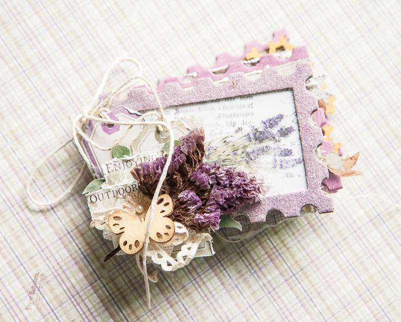
This is the tag I’ve made:

IMG_0423

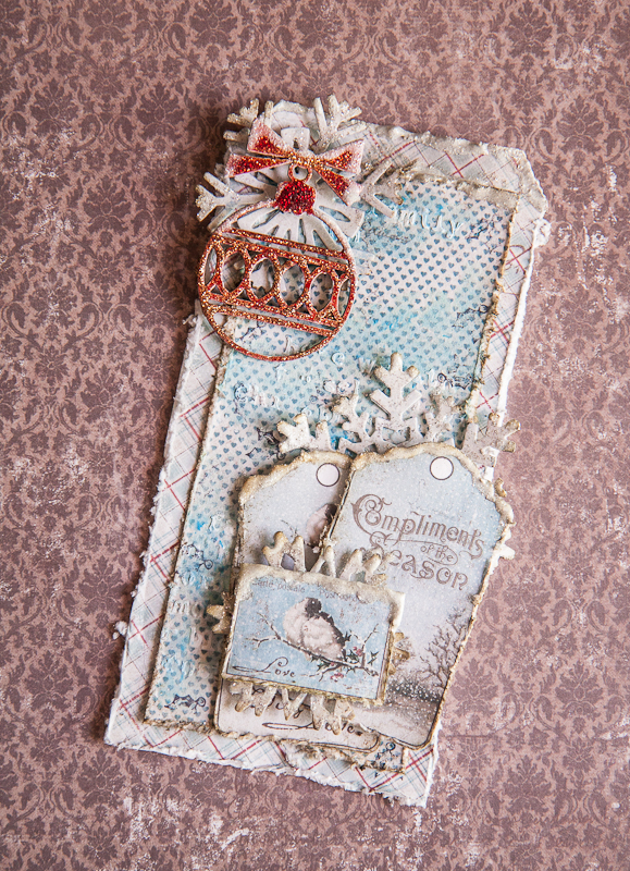
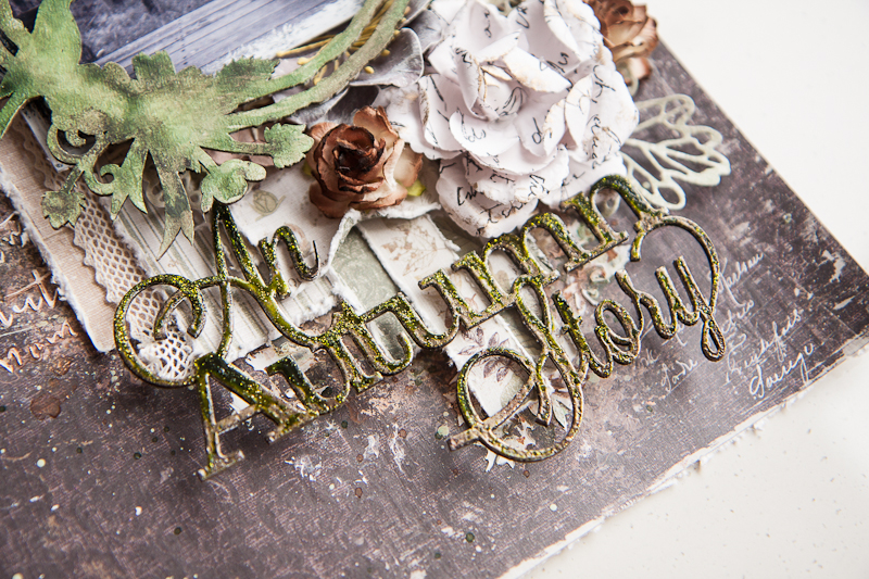
I’ve done some layering of papers from the 6×6 paper pad, as well as with the die cut tags and postal stamps. Again, my background work was simple – with some festive words stenciled with modeling paste and colored over with a matching blue in watercolor and paint.

Some close-ups:

IMG_0426

A chipboard ornament which I colored with glitter ink and stacked on top of a die cut snowflake from one of the more neutral colored papers from the paper pad. I chose red to highlight the color in the bottom-most piece of patterned paper and to use it as an accent color that really popped.

IMG_0427

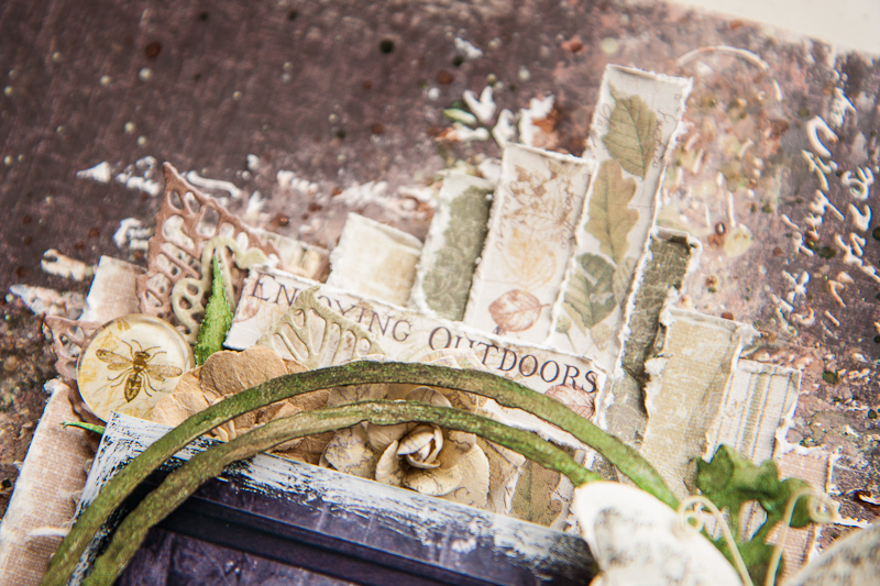
Layering of the tags which I fussy cut out. To create the snow falling on the tags, I added generous amounts of white glitter paint and allowed it to dry.

IMG_0429

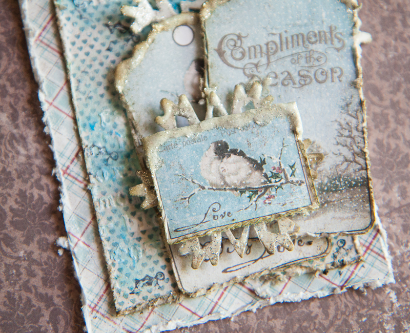
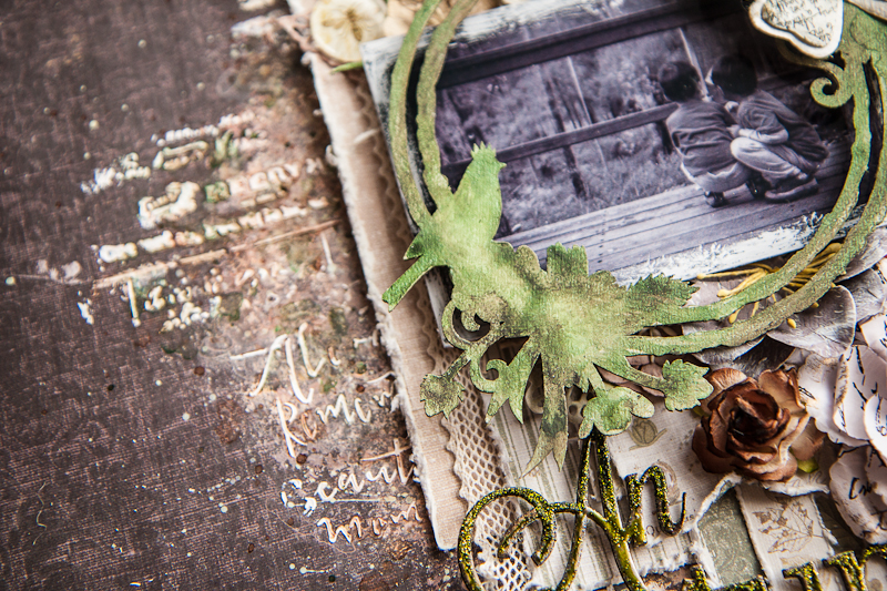
This postage stamp really warms my heart! It reminds me of exactly what we do in cold weather with our loved ones – we cuddle!

That’s all I have for today. Have a great day ahead!

Maja Design papers used:
Home-for-the-holidays-P
6×6 paper pad

Other supplies:
Mediums – 13@rts
Snowflake die – Sizzix

Jelissa-sign


Sweet Baby

0

Posted by Jelissa Mei

26 November, 2015 - , , ,

Write a comment

Hello Maja fans!

I’m finally able to share a layout I made of my little girl – it took awhile to get those photos printed! I was very tempted to use the Vintage Baby collection, but thought I would have a bit of fun with a collection that’s not baby-based.

Here is the page, made with the gorgeous pinks from Summer Crush:

IMG_0369

I choose this particular sheet “Off to meet him” as the background color matches my photo’s perfectly. I also liked how Marie has drawn the images such that my photo and clusters can be placed in the centre without being too cliche or flat. My background is very simple painting with pink and brown, and I had added my stenciled lace after the painting so that I get a nice contrast of white against the colors. Usually my stenciled designs get lost in the colors I add so this is one way of letting them stand out.

Some close-ups:

IMG_0372

My layers of papers, made from scraps from the same collection. I also have a piece of chipboard which I tucked in between and colored with various dimensional and distress paints.

IMG_0375

My floral cluster to make it more feminine. Underneath is a spare die cut leaf which I had from a previous project made with Enjoying Outdoors.

IMG_0377

And my title which I had colored with gelato and watercolor pencil to match that of the ladies in the corner.

And that’s all I have for today. Thanks for dropping by the blog!

Maja Design products used:

Summer-crush-KL

Off to meet him, He gives her flowers, Met her at the dance, Sweetheart

Other supplies:

Mediums – 13@rts (paints, modeling paste, gesso), Art Anthology (dimensional paint), Rangers (distress paint)
Flowers: Prima Marketing Inc
Chipboard: Blue Fern Studios

Vintage Summer card

2

Posted by Jelissa Mei

12 November, 2015 - ,

Write a comment

Hello friends, I’m back on the Maja Design blog again today with a simple card to share with you. Don’t be surprised, even in a small simple card there are design principles you can follow to make your card visually more pleasing to the eye.

IMG_0349

When layering my papers, I like to alternate between a neutral shade like grey, off-white or beige and what I like to call a “character color”. Basically, it’s the color that sets the theme and feel of the project and gives it its “character”. In the case of this card, my “character color” is the soft purple with tinges of pink and it has given the card a romantic and feminine hue as it is going out to a very special lady. So following this guide, I alternated off-white with purple, and on the purple itself, varying between intricate designs like paisley swirls and simpler mini fleur di lis. The contrast between these elements lends a lot of dimension and pleasure to our eyes.

Some close-ups:

IMG_0350

I stamped on my sentiment on a solid purple background and juxtaposed it next to the banner with more off-white so that it’s obvious it’s the message I want to send to my recipient. The banners were arranged to form an inverted triangle with the floral cluster, so that gives the visual flow of the card.

IMG_0351

A little bit of the background mediums work: stenciling, painting and some stamping. I used a lace border stencil for a more feminine touch, and a little splash of blue just to create a color accent. I also placed the cut-out from the info strip diagonally across my sentiment for a smooth visual flow as that is the direction our eyes would follow when reading from one line to the next. My chipboard was altered with simple heat embossing.

Well I hope these guidelines are useful for you when thinking about creating your next project. Until then, happy crafting!

Maja Design papers used:

Vintage-Summer-Basics-L1

1925, 1912

Other supplies:

mediums: 13@rts (paints), Blue Fern Studios (embossing powder)
chipboard: Blue Fern Studios
flowers: Prima Marketing Inc

Jelissa-sign

An Autumn Story

1

Posted by Jelissa Mei

29 October, 2015 - , ,

Write a comment

Hello Maja fans!

Today I’m up on the blog with another layout I created using the Enjoying Outdoors collection. This time, I focused on the rich greens and browns of the papers and used it for a trip we took in the forest during autumn.

IMG_0282

We were on a broad walk in the middle of an age-old forest of karri trees and there was a little lookout by the side. Being boys, my two sons ran up the lookout and were surprised to find a little star badge on one of the wooden beams. They went on to make up their own story about how it got there and a new adventure was created. I love it that they are so creative and curious in their own ways about the world around them, and that there is always a story (pretend or not) to everything they see.

Some close-ups:

IMG_0285

My paper layers, which I made into a vertical line to imitate the towering trees in the Valley of the Giants, a very ancient karri tree forest. By alternating the different shades of brown and green, and with the patterns in the info strip, I was able to add a lot of contrast and details. My chipboard was embossed in brown, and I painted green glitter paint over.

IMG_0287

Adding more details with the die cut leaves and words from the info strip.

IMG_0290

A simple background of stenciling words and sprinkling of paints. My chipboard frame was painted with watercolors and I also had lace and hessian tucked into the paper layers.

That’s all I have for today. Thanks for dropping by!

Maja Design papers used:

Enjoying-Outdoors-L

Garden Notes, Harvest Time, Flourishing, The Great Nature, Having Tea in the Sun, Beautiful Trees, Woodlands

Other supplies:
Mediums – 13@rts, Colorarte
Chipboards – Blue Fern Studios
Embellishments – Prima Marketing Inc

Jelissa-sign

Enjoying Outdoors

0

Posted by Jelissa Mei

15 October, 2015 - ,

Write a comment

Hello Maja fans!

I’m on the blog today to share a mini album I’ve made from the brand new collection Enjoying Outdoors. I love the sweet combination of purples with browns and greens – and reminds me of the lavender fields we saw while on a road trip to the forests in Western Australia.

IMG_0258

Here is the cover of my mini. I love the stalks of lavender in the die-cut sheet but lavenders don’t grow well here, so I tied a small bunch of dried forget-me-nots (I keep lots of these whenever I receive a bouquet of flowers, which is not very often by the way!) with some lace. The die cut tags from the 6×6 paper stack are the perfect size for the mini too.

Here’s a look at the inside pages:

IMG_0261

This is really a very small album – about 3″ by 5″ so I decided to keep things simple inside without excessive layers. Just lightly distressed edges on the papers and banners made from the info strip to give me plenty of space for photos and journaling.

IMG_0262

A little more fun here with chipboard and lace. We always try to spot mushrooms on our walks in the park so I added those as a reminder of the little bits of nature we see when we’re outdoors. Now if only there were truffles here….

IMG_0264

In the end, I couldn’t resist adding more layers and flowers.

IMG_0265

And the last two pages of the album with simple photo mats and flat flowers so that the album doesn’t end up too chunky.

That’s all for the mini album and I hope to fill it up soon with pictures of our family out in the parks for our walks and the fun things that we see on the way!

Maja Design papers used:

Enjoying-Outdoors-P

6×6 paper stack

Other supplies:

Chipboards – Blue Fern Studios
Flowers – Prima Marketing Inc
Mediums – 13@rts (paints), Rangers (Distress Glitter)

Jelissa-sign