Hello friends, I’m back on the Maja Design blog again today with a simple card to share with you. Don’t be surprised, even in a small simple card there are design principles you can follow to make your card visually more pleasing to the eye.
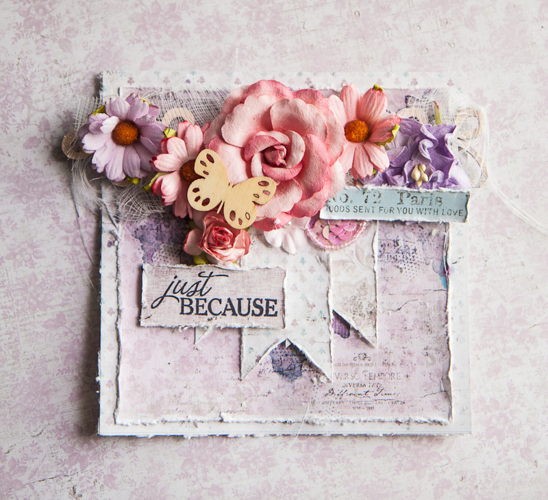
When layering my papers, I like to alternate between a neutral shade like grey, off-white or beige and what I like to call a “character color”. Basically, it’s the color that sets the theme and feel of the project and gives it its “character”. In the case of this card, my “character color” is the soft purple with tinges of pink and it has given the card a romantic and feminine hue as it is going out to a very special lady. So following this guide, I alternated off-white with purple, and on the purple itself, varying between intricate designs like paisley swirls and simpler mini fleur di lis. The contrast between these elements lends a lot of dimension and pleasure to our eyes.
Some close-ups:
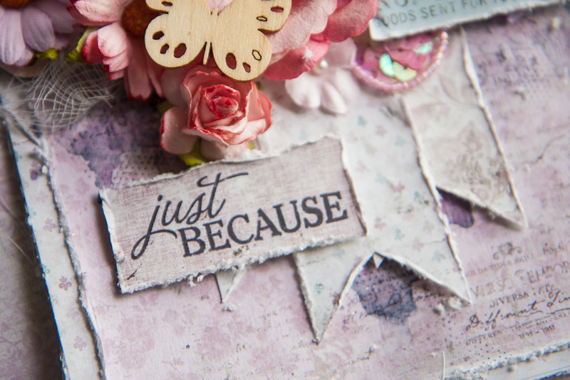
I stamped on my sentiment on a solid purple background and juxtaposed it next to the banner with more off-white so that it’s obvious it’s the message I want to send to my recipient. The banners were arranged to form an inverted triangle with the floral cluster, so that gives the visual flow of the card.
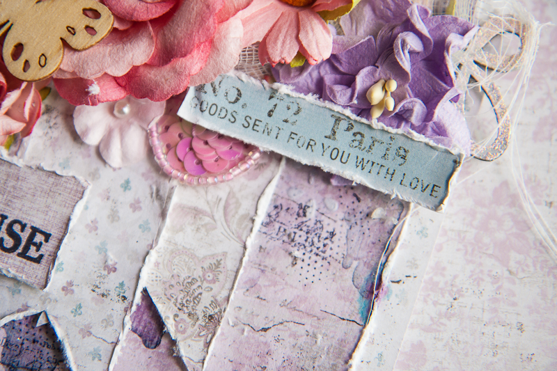
A little bit of the background mediums work: stenciling, painting and some stamping. I used a lace border stencil for a more feminine touch, and a little splash of blue just to create a color accent. I also placed the cut-out from the info strip diagonally across my sentiment for a smooth visual flow as that is the direction our eyes would follow when reading from one line to the next. My chipboard was altered with simple heat embossing.
Well I hope these guidelines are useful for you when thinking about creating your next project. Until then, happy crafting!
Maja Design papers used:

1925, 1912
Other supplies:
mediums: 13@rts (paints), Blue Fern Studios (embossing powder)
chipboard: Blue Fern Studios
flowers: Prima Marketing Inc

2 Comments
great design and lovely presentation of the collection
Beautiful card! And thank you for the design tips, very helpful.