Hello Maja fans! It is my turn on the Maja Design blog to share my latest creation. Today, I have a boyish layout for you.

What I did was to create a layout based on contrast. Generally we all like to use neutral and light colored backgrounds for our projects but a dark background like black can give a very outstanding effect. To make my dark background more obvious, I backed it up with a sheet of grey paper from A Gift for You collection. And to make my dark paper even more distinct without the use of any mediums, I distressed the edges so that the white of the paper shows and forms a natural border.
Now for some close-ups:

You can see more clearly some of the details I have in my mixed media background that added on to the contrast. I have subtle stamping in grey and bigger splatters of white ink. I also have gesso on the background but I didn’t want the white from the gesso to be too stark, so I wiped it down for a more toned down look. And on that part of the white, I made splatters of black ink.
The layering of my papers also used very neutral colors in order for the dark background and the amount of work done on it to stand out. The only color I have is blue which I used to match the color of my boys’ clothes (yes, their daddy is a boy too :D). My chipboards were embossed with two colors – metallic grey and black to match the tones of the whole page.

Keeping my embellishments simple and monotoned so that they don’t steal the attention away from my background. Even my title was simple with just a little bit of texture on it.

I had used circles on my page to keep the whole theme and flow consistent, and I wanted some bigger circles to create a direction that moves across the page from the left to the right. These bigger circles have to stand out from the busy background, but not so much that it becomes too obvious. So instead of using stamped white embossing powder (which can be too bright), I stamped using white gesso instead. Some parts of the stamp design come out very clearly, some parts are less obvious so the overall effect is that it does not over-power the background.
So these are the tips I have for you today to create something unusual from your Maja papers. Thanks for dropping by!
Maja Design papers used:

wrapped in old newspaper, my dear friend, when the snow is falling

No. XVI

1902
Other supplies:
Mediums – 13@rts matt paint (Cobalt Blue), Splash Ink (Black, White), Gesso, modeling paste
Chipboards – Blue Fern Studios
Flowers and trinket – Prima Marketing

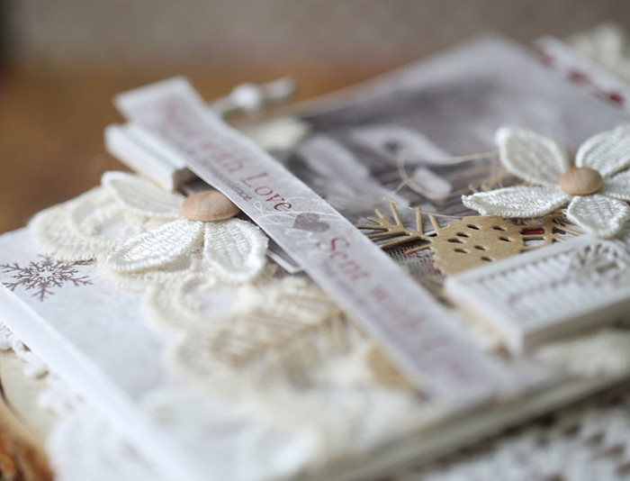
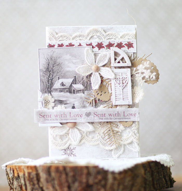
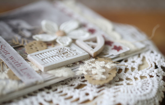 I bought the wide lace with flowers and now I am cutting the bits and pieces from it and add them to my card.
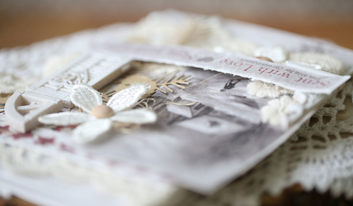 kraft and wood accents make the card more warm and “real” as for me.