Snails

2

Posted by Pascale B

1 September, 2016 - , , ,

Write a comment

Hello Sweeties

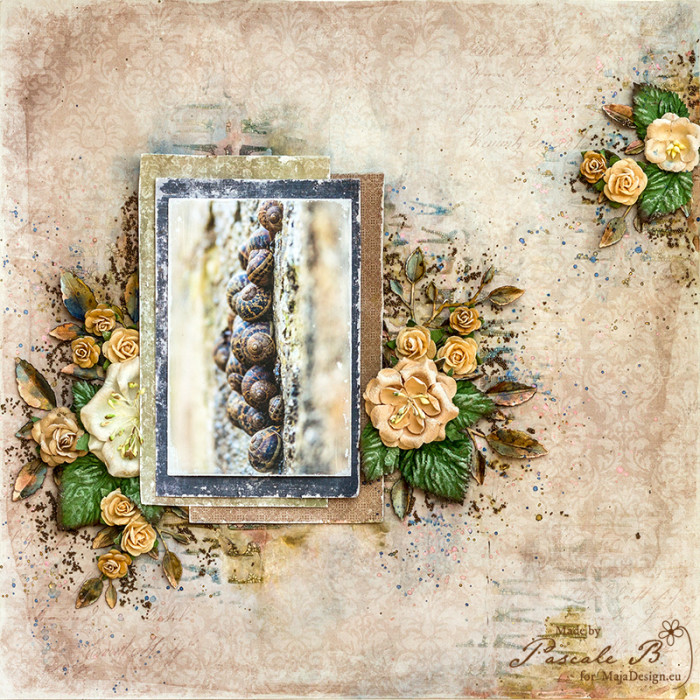
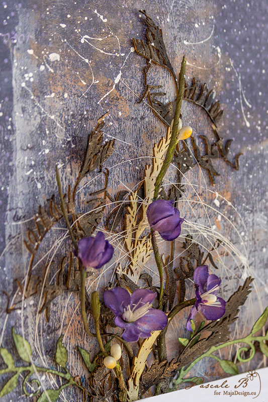
Today, I’m up on Maja Design blog with a new layout made with different paper collections. You will see how easy it is, to mix them all.

Snails by Pascale B.

I used the Wind in the air paper from the Summertime collection as background. As usual I primed it with clear gesso before adding a design with a stencil and clear crackle paste.

Snails by Pascale B.

When dry, I added some colors with twinkling H2Os that match the photo.

Snails_detail2_PB

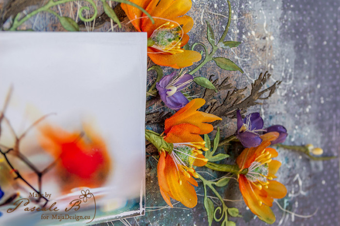
I chose different papers from different collection to add under the photo: a dark blue from from the Vintage Autumn Basics collection and two brown-green from the Enjoying Outdoors collection. I distressed the edges.

Snails_detail3_PB

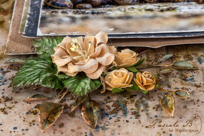
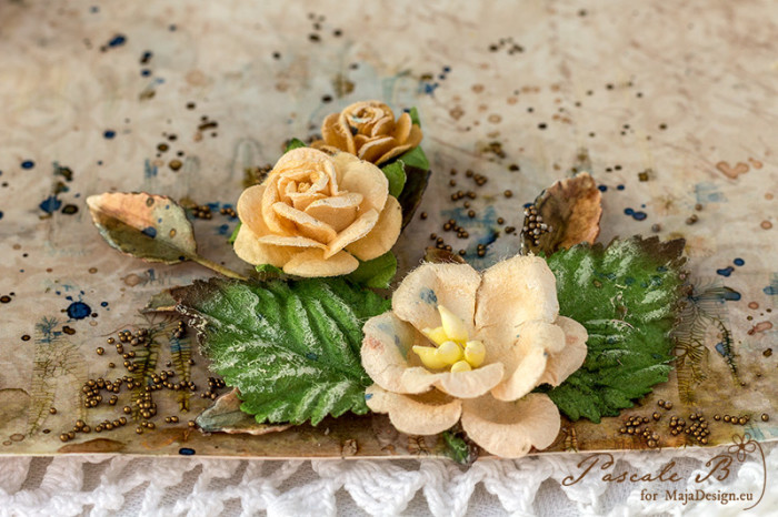
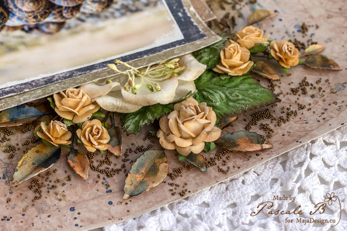
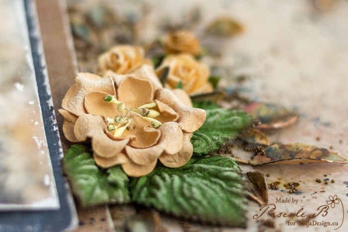
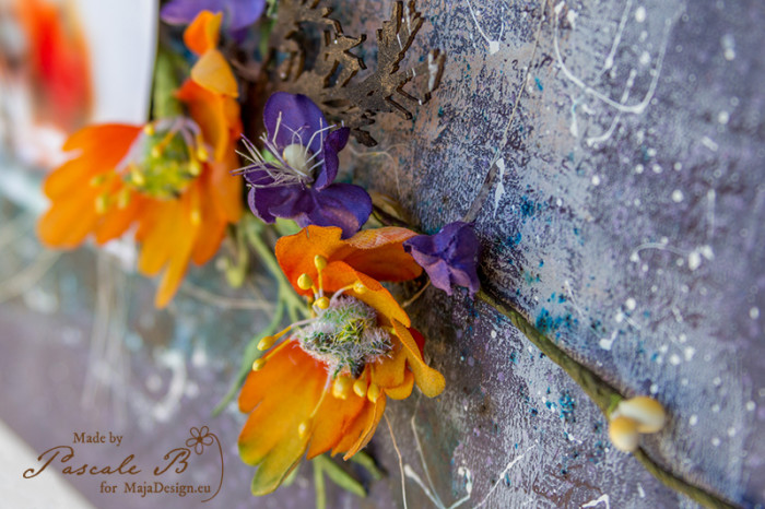
Then I started to build the layout: I started to glue the papers, then I added progressively all the elements starting by the biggest and finishing with the smallest (the leaves).

Snails_detail4_PB

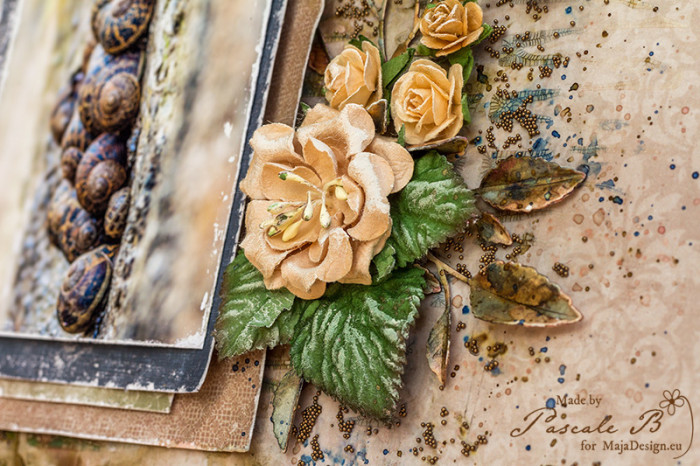
When happy with the result, I added some micro beads.

Snails_detail5_PB

Maja Design papers:

Wind in my hair bs no.XXI BS Enjoying Outdoors paper stack
Summertime
Wind in my hair bs
Vintage Autumn Basics
no.XXI bs
Enjoying Outdoors
Paper Pad 6×6

Pascale-sign

Flowers

0

Posted by Pascale B

15 July, 2016 - ,

Write a comment

Hello Sweeties

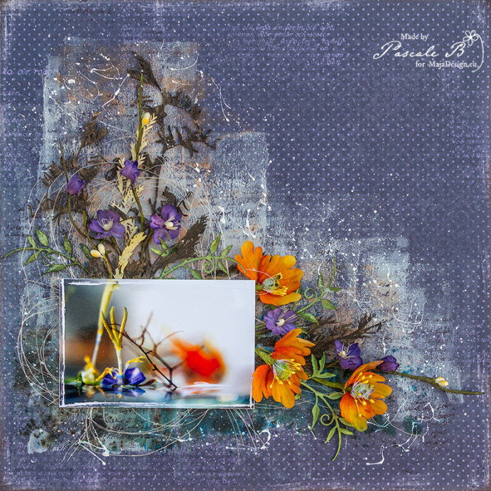
Today I’m up on Maja Design blog with a layout published in Histoires de Pages n°63, a french magazine.

Fleurs by Pascale B.

I started to apply a matte gel medium to protect the paper. Then I added a thin layer of white gesso and some orange Silks with a brayer.

Fleurs by Pascale B.

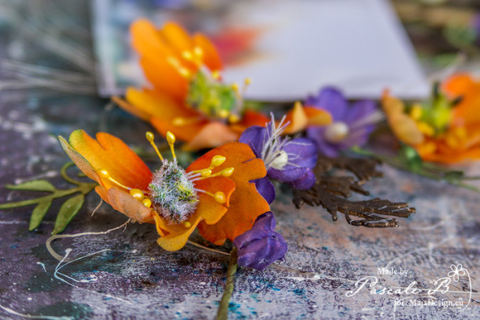
I covered the chipboards with black gesso and some Rust Mica Powder, except one which I colored with a Twinkling H2O and the same Mica Powder. I colored the flowers with some Twinkling H2Os too.

Fleurs by Pascale B.

I added some blue and green bisters to the background to remind the water reflection.

Fleurs by Pascale B.

I used a 3D matte gel to glue all the embellishments.

Fleurs by Pascale B.

I finished with some random stamping and splatters.

Ska vi ta en fika
Våffla m. björnbärssylt

Pascale-sign

Moment inoubliable

1

Posted by Pascale B

19 June, 2016 - ,

Write a comment

Hello Sweeties,

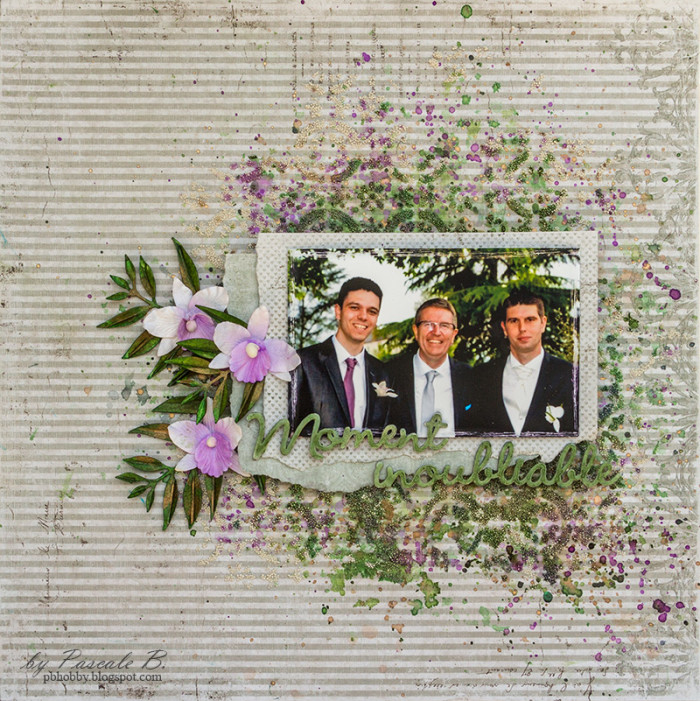
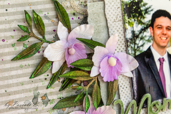
Today I’m up on Maja Design blog with a new layout I made for a friend featuring the men in her life : her husband and their sons.

Moment by Pascale B.

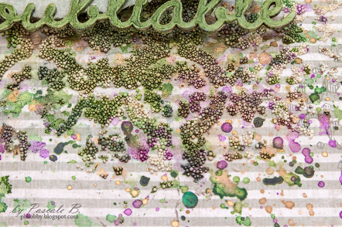
As usual, I started with a layer of clear gesso before adding a design with a stencil and a light modeling paste. While the paste was still wet I sprinkled some mini Art Stones.

Moment by Pascale B.

I simply covered the title with white gesso and colored it with a green Twinkling H2O.

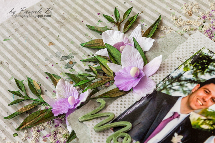
Moment by Pascale B.

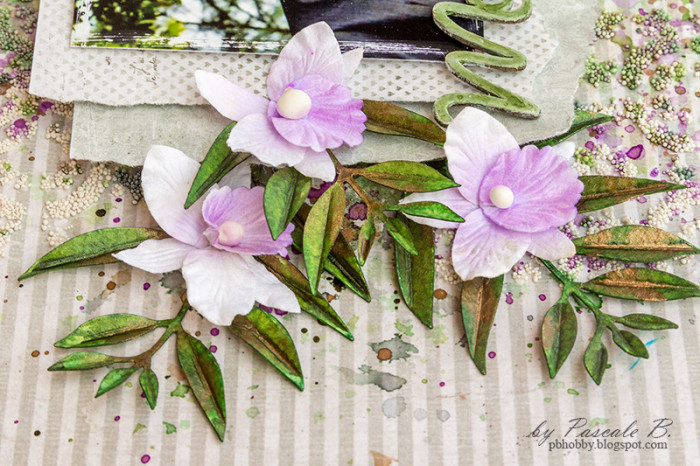
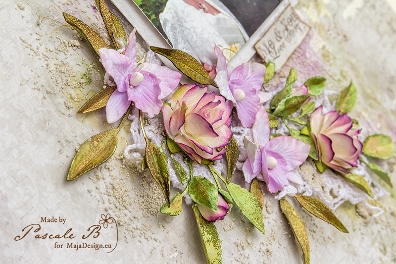
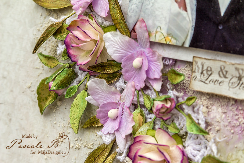
I colored the die-cut leaves with differents colors of Twinkling H2O and as well as the orchids. I tried to find a color that matched the tie.

Moment by Pascale B.

When the light paste was dry and the Art Stones were glued I colored the background with the same Twinkling H2O too.

Moment by Pascale B.

Maja Design papers:

Vintage-Romance-P
Vintage Romance
When I saw you bs Walk with me bs To be with you bs

Pascale-sign

mm

Pascale B

Hello, I'm Pascale B. from France. Since I began to scrap, flowers are part of my layouts, and I gradually started to use mixed media as well. I don’t know how to define my style, perhaps something like free vintage shabby style could be a good definition. Visit me at www.pbhobby.blogspot.com

See the World in My Favorite Car

1

Posted by Silje Kristin Aunan

5 June, 2016 - ,

Write a comment

Good day everyone, I hope you all had a great weekend ? 🙂

My weekend has been great, I’ve helped a friend with making place cards, decorated small and large candles to the late night hours. But today is a new day and this day I whant to spend with my family.

Imagine that it is already my turn to share one of my projects, made with paper from Maja Design. One thing I really like is to make something I’ve never done before and this time I have really gone beyond my comfort zone.
 I have made a LO, one that is 8×8 by build the frame / plate with thick cardstock. This I have done by cutting out two squares that are 8×8 and glue them together, then I cut out two squares with holes in and glue on the top. All the sides and edges are decorated with patterned paper, I used Distress Ink Ground Espresso for the inking. In the corners there are old spikes and the text “See the World – Live Everyday ” on the bottom of the frame is Rub Ons from Tim Holtz.

I have in a long time wanted to make one little rough project with the rough sheets from the new collection Vintage Romance. The sheets I’ve used is :

Forget Me Not, Wedding Day, Honeymoon forward and back side and the images is taken from ephemera.

Vintage-Romance-P

The sheets that I have used under the images, I have torn the edges, befor I them. The design is build ​​up with 3D foam pads.

When I made the LayOut, I decided to try to get many different details, but would work well together. In the bottom corner, I have two different wood from Wycinanka, one is a hand that I have embossed with Distress Embossing Powder – Walnut Stain, Ranger Embossing Powder Black and some Gold powder. The other wood I ‘ve used is one wheel that is embossed with Aged Copper from Stampendous .

The other details are a paper hat that I’ve clipped from the paper called He ‘s my Man. On the same sheet is also a small bow, so instead of using the one in paper I created one in brown ribbon .

Under the details there is a rusty metal plate and beside it, there is a dark brown twine under the Images.

In the top corner to the right, I have small spikes, rusty metal plate, metal from Prima which is embossed with Walnut Stain from Distress and Gold Embossing Powder. Here you can see more of the thread, which is under images and the cars that are on the side.

On the other side again, there are many more details. I have used the inside of a clock, vintage cars, metal from Prima, a large plate with rust, spikes and the black arrow is Rub Ons from Tim Holtz .

On several places I’ve created small pennants that I have placed in large cracks, under and over the images, I’ve did that just to add something extra. In addition to the large arrow, I have also used a smaller arrow.

The idea behind this LayOut is to take the opportunity while you have it, take advantage of the opportunities while you are young and before the clock getting away from you. Not least have fun on the journey, meet new people, take a chance after chance and share the moments with those  you love. We only live once, why not explor the days to maximum, as long as we can do it? 🙂 In other words, this LO you give to someone you like alot and the one you have experience the world with.

SiljeKristin-sign


You & Me

0

Posted by Pascale B

29 May, 2016 - ,

Write a comment

Hello Sweeties

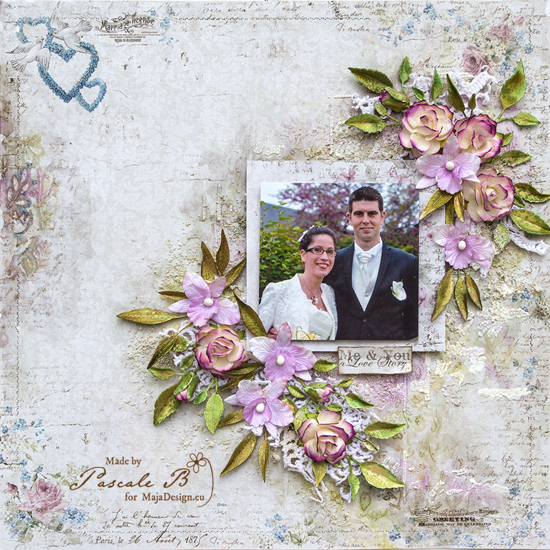
Today, I’m up on Maja Design blog with a new layout and a video tutorial. I worked with the new collection: Vintage Romance.

You and Me by Pascale B.

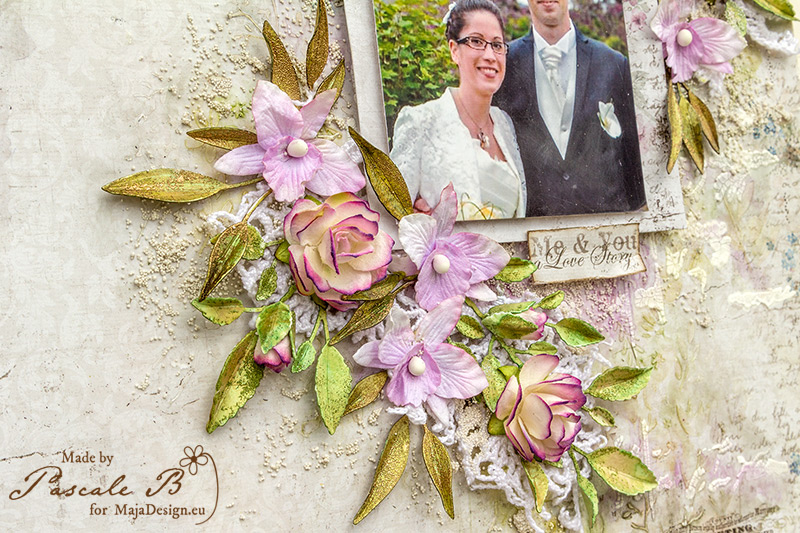
Some close-ups:

You and Me by Pascale B.

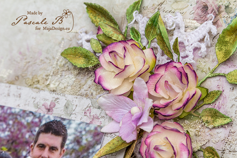
Some close-ups:

You and Me by Pascale B.

You and Me by Pascale B.

You and Me by Pascale B.

And here is the video tutorial:

[youtube https://youtu.be/US_eCnUl9TY]

Maja Design papers :

Vintage-Romance-P
Bride & Groom Love is in the air
Bride and Groom Love is in the air


Pascale-sign

mm

Pascale B

Hello, I'm Pascale B. from France. Since I began to scrap, flowers are part of my layouts, and I gradually started to use mixed media as well. I don’t know how to define my style, perhaps something like free vintage shabby style could be a good definition. Visit me at www.pbhobby.blogspot.com