Stay Positive Layout with Elena

2

Posted by Elena Olinevich

30 October, 2020 - ,

Write a comment

Hello Maja Friends,

Today I am happy to share with you my layout that I’ve made recently with the brand new Miles Apart collection.

I found pictures taken during Summer 2019, and since 2020 is not the best year for us, I decided to look for the good memories from the last year.

I played with blue and pink tones, though my daughter doesn’t like pink and anything girly, and even made a short hair cut this year, I thought that I keep all my layouts for my memory, so it’s ok to make it soft and feminine.

I made a rectangle die cuts , some of them are from old collection Antligen, as well as some fussy cutting  and created many layers.

I cut out the title from the paper cut outs with the info about Maja Design papers, and I suppose it is a good idea that the paper name is a good title for any of your project, have you used them as I do?

Since the pictures were taken near the fountain so I ‘ve added some watercolor splashes.


Stay Positive for the upcoming winter days.


Products used:

Miles Apart:

Wedding Card -Envelopes

0

Posted by Elena Olinevich

6 January, 2017 - ,

Write a comment

Hello Maja Friends,

Christmas is over and it’s time to start creating something for the spring.

Many wedding ceremonies take place in the spring – summer seqason, so I decided to go ahead and start creating some weding cards.

Wedding Envelope for Maja Design by Elena Olinevich1

But these cards are not usual , they are more like an embellished envelope to put a gift cretificate or money.

Anniversary Card for Maja Design by Elena Olinevich

I used almost teh same sketch but different papers from Antligen collection.

Wedding Envelope for Maja Design by Elena Olinevich4a

I made a lot of die cutting using elegant frames , I guess they are perfect for any kind of wedding or anniversary card type.

Wedding Envelope for Maja Design by Elena Olinevich3

Some of them are almost white , the color that is most favorite for the weddings

Wedding Envelope for Maja Design by Elena Olinevich1a

Wedding Envelope for Maja Design by Elena Olinevich4b

But one card goes out of a normal range, it is more bright.

Wedding Envelope for Maja Design by Elena Olinevich2

Wedding Envelope for Maja Design by Elena Olinevich4c

However I prefer soft colors for my cards

Wedding Envelope for Maja Design by Elena Olinevich4

Конверт на свадьбу для денег

Products used:

Spellbinders Frames Dies, Prima Marketing Flowers.

Save

Green Fingers

4

Posted by Jelissa Mei

25 June, 2015 - ,

Write a comment

Hello Maja friends!

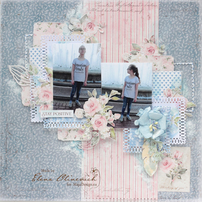
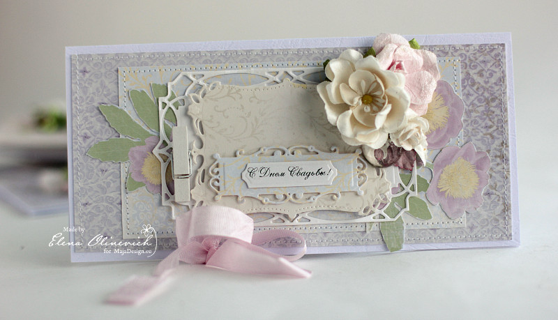
I’m in on a hot Thursday afternoon to share with you my latest project made for Maja Design using the Antligen collection. By the time I finished my layout, my fingers were all purple and white, but what I really want them to be is green! I’ll explain why later, but firstly, here is my page:

IMG_9857

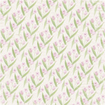
I’m using the Antligen collection from Maja Design, which is really all about Springtime and the earth coming back to life with beautiful flowers after a long cold winter. That fitted the nature theme in my photo perfectly (although the photo I chose was one I took of my favourites – Lavender Augustafolia, was in autumn). Now, the climate here in Singapore is really not suitable for growing lavender because of the over-bearing humidity which kills off the plant by encouraging root rot. In my last tries, I managed to get the seeds to germinate and sprout, and then suddenly they all died off after a month. Then someone gifted me a pot of blooming ones, but they all never survived more than two months even with full sunlight and careful watering. Bear in mind I’m someone who can actually kill cactus…. So when we booked ourselves into the Lavender and Berry farm on our Perth trip, you can imagine how gaga I went over the gorgeous flowers in bloom. And it was effortless for them. *Green eyes* Now I’m trying to grow some cherry tomatoes but they all seemed to have stopped at the seedling stage. Maybe I should give up and just paint my fingers green instead.

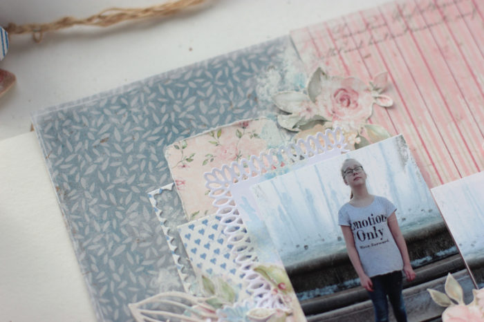
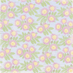
So my long story aside and back to the project. I’ve kept my paper layering to a minimum, with just enough to create the flow in my composition and focused a lot more on the background details this time round. Maja Design collections come with a mixture of beautifully drawn images as well as neutral plain papers, which are perfect for adding on mediums to create your very own background if you are into experimenting with mixed media like me. The colors also make it easy to match papers across different collection as well.
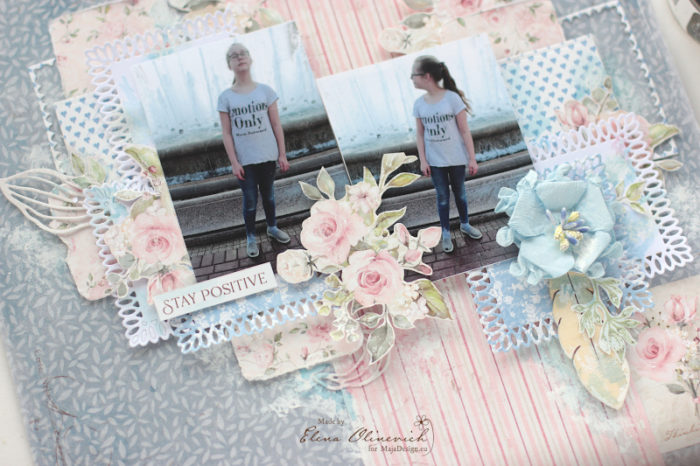
Some close-ups:

IMG_9862

Back to my usual style of tucking in chipboards in between my papers. I have strips of green and purple paper from the Antligen collection, as well as some fussy cut flowers from the collection to fill out the composition nicely. To make the fussy cut flowers stand out, I doodled the edges with black gelato. The chipboard I colored with three different shades of purple, two shades of green, and adhered clear Distress Glitter on the edges for some interesting texture.

IMG_9865

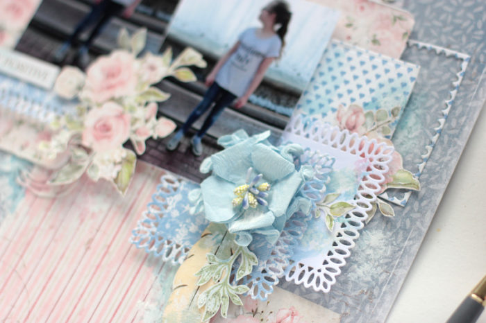
A closer look at what I did for the background – stenciling and doodling around the relief, sprinkling of transparent and black microbeads, splatters of watercolor and acrylic inks.

IMG_9860

Hidden details behind the photo with random stamping, a painted metal water fountain with little roses tucked in. It’s starting to look like an English garden! My title is “Great Outdoors” and it describes so well my love for everything under the sun.

IMG_9861

Filling out the bottom part of the composition nicely with some chipboard vines. I painted with two different shades of green and sprinkled on clear microspheres when the paint is wet. And just in case, I sealed the beads with a thin layer of gel medium.

So that’s all I have for today. Before you go, I would love to hear some of your gardening wins and woes too!

Maja Design papers used:

Antligen

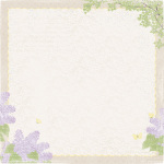
Syrenen blommar, Kaffe pa trappan, Naturen dofta, Forsommar, Vardagjamning

Other supplies:

Flowers and embellishment: Prima Marketing Inc, Wild Orchid Crafts,
Stencil: Prima Marketing
Chipboards: Blue Fern Studios
Mediums: 13@rts (modeling paste, gel medium, acrylic inks, paints, microbeads), Shimmerz (Inklingz), Rangers (Distress Paint and Stains), Twinkling H2Os
Stamps: Kaisercraft, Blue Fern Studios

Jelissa-sign

Making Pretty Gifts

4

Posted by Gabrielle Pollacco

25 February, 2015 - , , , ,

Write a comment

Crate_Gabrielle_Pollacco_Maja_Design_view1s

Hello Maja fans! It’s Gabrielle here with you today to share a fun little ‘Thinking of You’ gift idea.  I found this cute little unfinished wooden crate at my local Dollar store and thought I would use some of the fresh pretty patterns in the Maja Design papers to dress it up to create a candle holder gift set.

Lantliv-P (1)

Antligen

I used the ‘Naturen doftar’ paper from the ‘Antligen’ paper collection to cover the outside strips of the wooden crate.  I used a mixture of equal parts white glue and water to adhere my paper strips to the wooden crate.  I just love the sweet white dotted green paper for this, I think it gives the project an nice Spring feel to it.

Crate_Gabrielle_Pollacco_Maja_Design_view2

For the inside of the box I used the pretty gingham design in the ‘Kitchen Garden’ paper from the ‘Life in the Country’ collection.  And for the middle/side walls I used the lovely script/floral paper that is on the reverse side of the Kitchen Garden paper.

Crate_Gabrielle_Pollacco_Maja_Design_closeup

For the front of the box I wanted to keep the clean lines of the box design so I didn’t over embellish the box, I just added a few paintable Prima Blooms, a twine bow and a Dusty Attic swirl chippie (Elegant Swirls#13), which I painted white and edges with some brown chalk ink (Ingvild Bolme’s Branch Bark).

I hope I’ve inspired you to pull out some of your favorite Maja Design papers to create a little gift to cheer a friend of yours!  Thanks so much for stopping by the Maja Design blog today, we love to hear your feedback on our projects! xo

Gabrielle-sign

So Sweet ~ Watching Them Grow

2

Posted by Gabrielle Pollacco

19 November, 2014 - , , , , , ,

Write a comment

So Sweet_Sig_Layout_Gabrielle_Pollacco_Maja_Design_07

Hi all, it’s Gabrielle here with you today to share with you my latest page using Maja Design papers.  As I was scrapping this recent photo of my youngest daughter, I was struck by how much she’s grown up.  I can’t believe she is a teenager now (turned 13 over the summer).  I miss her being my little girl, but I also have enjoyed every stage of her life, this girl cracks me up with her funny sense of humour and quirky style.

For this page I used a modge podge of Maja Design papers.  I more often than not combine a variety of Maja papers, coordinating them by color rather than collection name.

So Sweet_Sig_Layout_Gabrielle_Pollacco_Maja_Design_04

I used a variety of scraps in neutral tones and greens to make my rolled paper accents.  I rolled up the scraps and then bound them with some twine.  I added a fun l’il door hook on the side of my paper from Ingvild Bolme’s Junkyard Findings.

So Sweet_Sig_Layout_Gabrielle_Pollacco_Maja_Design_05

I used a variety of Dusty Attic chipboard as part of my page design, including a Skeleton Clock Frame, Foliage, and the ‘So Sweet’ title.  For the frame I first painted the pieces with some white Gesso.  Then I randomly dabbed on some ‘Broken China’ and ‘Peeled Paint’ Tim Holtz Distress Ink.  I did a little edging with Ingvild Bolme’s ‘Branch Bark’ Chalk Ink.  Then I added a coat of Inksenttials Crackle Medium.  When it was dry  and crackled I dabbed on some ‘Walnut Stain’ Distress ink so that it got in the little cracks and whipped off the excess ink.

So Sweet_Sig_Layout_Gabrielle_Pollacco_Maja_Design_03

I used the 11th of March-bs paper as the green background frame for my page and as the main background paper I used the backside of ‘Flannel Shirt’ paper from ‘Walking in the Forest Collection’….this is one of my favorite papers to use as a nice neutral background, especially when I do some mixed media on the page as I did here.  I used a bit of Broken China and Peeled Paint Distress ink pads on the page and added some texture with home-made texture paste and a Crafter’s Workshop Stencil called ‘Mini Damask’.  The butterfly is an image that I printed on a piece of transparency and cut out.

So Sweet_Sig_Layout_Gabrielle_Pollacco_Maja_Design_06

I wanted to keep my blossoms soft and clean, so I went with a burlap bloom from Petaloo and two white blossoms from Dusty Attic Designs.  The small sugared dots are from Prima.

So Sweet_Sig_Layout_Gabrielle_Pollacco_Maja_Design_08

The strip of lace I used on the bottom of the page and the natural floral cluster (just above the title) are both from Tresors de Luxe.  I had a little fun with the title.  First I gave it a coat of brown chalk ink ‘Knotted Wood’ by Ingvild Bolme, then I used some ‘Waterfall’ Stickles in the center of my alpha’s.  After it all dried I gave the whole thing a coat of gloss medium with some Glossy Accents.

Maja Design Products used in this project:  Vintage Spring Basics (11th of March-bs, 7th of April, 7th of April-bs), Antiglen (Kaffe på trappan), Walking in the Forest (Flannel Shirt-bs), Sofiero (brown dot).

I hope you enjoyed today’s project and hope you find yourself some time this week to get your Maja on.

Gabrielle-sign