“She loves in Colour” by Tina Ollett

1

Posted by Tina Ollett

25 April, 2017 - ,

Write a comment

Hello again everyone! Tina Ollett with you again today to share my next Maja project with you.
Today I have something much more different than I would normally do as a project for Maja. Whenever I look at my collections of Maja I see Vintage, Shabby, Shabby Chic. But never have I considered something country rustic! Well that is exactly what I have created for you today. This all come about when I come across my other Design Team project Moodboard at Dusty Attic. Of course by now you would all know that each and every project I create has an element or should I say a lot of elements of chipboards. Well anyway their moodboard this month motivated me to go in search for that perfect paper collection that could combine all this and more.

Walking-in-the-forest-P

Walking in the forest was the most perfect fit for my project today. All the rustic colours of the countryside!  You will see that choosing the papers for me was the hardest decision of all in the video that I made for this project today. If you keep scrolling through my blogpost you will find the link.

I have titled this project ……….“She loves in colour”…………

2017-04-25 2017-04-25 001 003 (1024x1020)

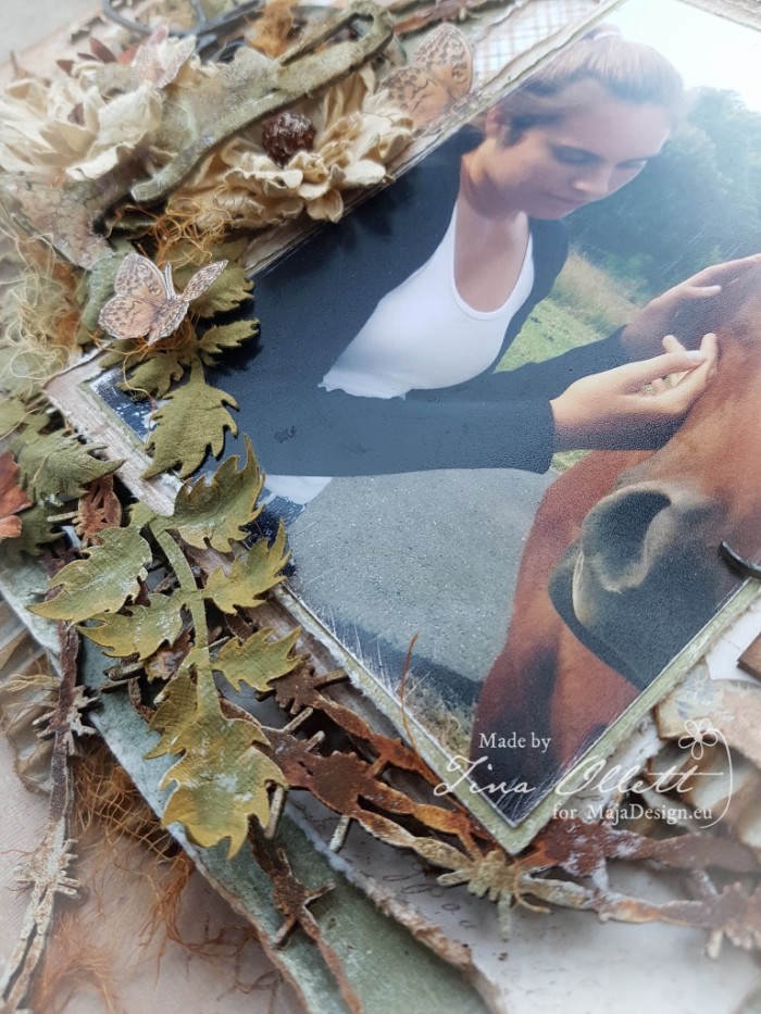
My photo of choice for today’s project was one taken late last year of my eldest daughter with a friend that we would see on my girls’ afternoon Violin tuition lessons. This friendly beauty lives in the paddock of the house that I would park at. And on most afternoons it would walk to my car just to check and see who it was! I was able to capture this gorgeous photo of both these beauties on one of our afternoon visits.

2017-04-25 She loves in Colour 012 (768x1024)

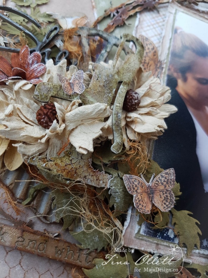
For this layout I have used my Maja Design papers in my layering with lots of blooms, chipboards and elements cut from the Die Cut sheet.

2017-04-25 She loves in Colour 013 (768x1024)

And from a different view.

2017-04-25 She loves in Colour 014 (1024x768)

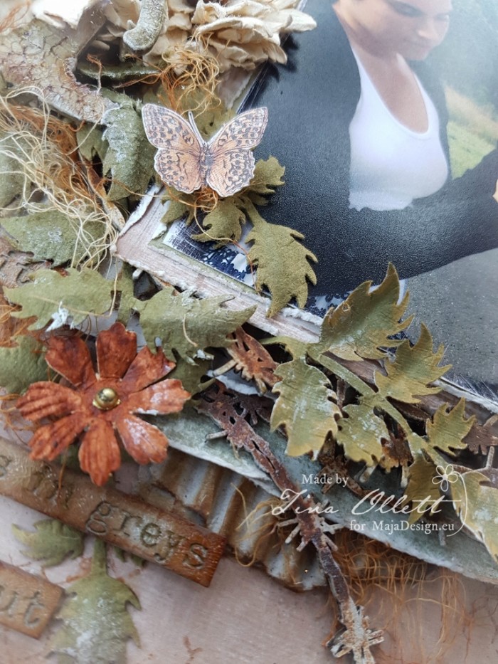
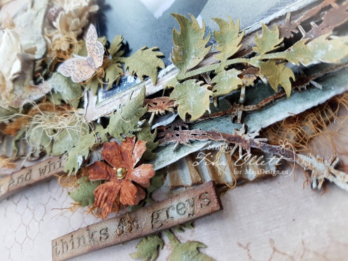
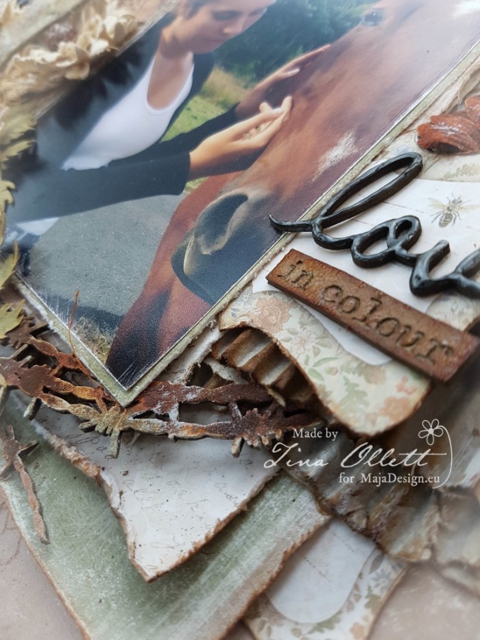
You can see above that I have used a chipboard quote. My title for this layout was taken from the quote. It reads:

She see in black and white, thinks in greys but loves in colour…..

2017-04-25 She loves in Colour 020 (768x1024)

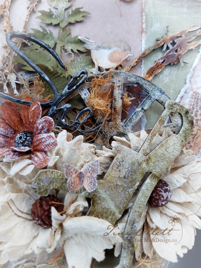
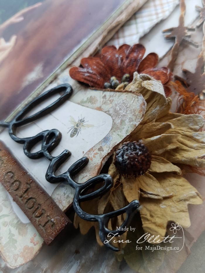
And the flowers are all from the 49andMarket series of Rustic Blooms. These were co-ordinated with some Dusty Attic chipboards that were coloured with differing mediums from Distress Inks to Rusting Powders and Crackle. If you follow the link below you will see how these were all dressed in the video.

2017-04-25 She loves in Colour 022 (768x1024)

This chippie was simply dressed with a little Liquid Pearls.

2017-04-25 She loves in Colour 023 (768x1024)

You can see above the layering of these gorgeous papers from Maja Designs. The die cut sheets are a fabulous idea to add that touch of difference to any layout. The journal cards I used from the Die Cut sheet were cut into mutiple pieces to make them go further. All the layers of patterned papers were sanded, distressed and randomly inked.

2017-04-25 She loves in Colour 025 (768x1024)

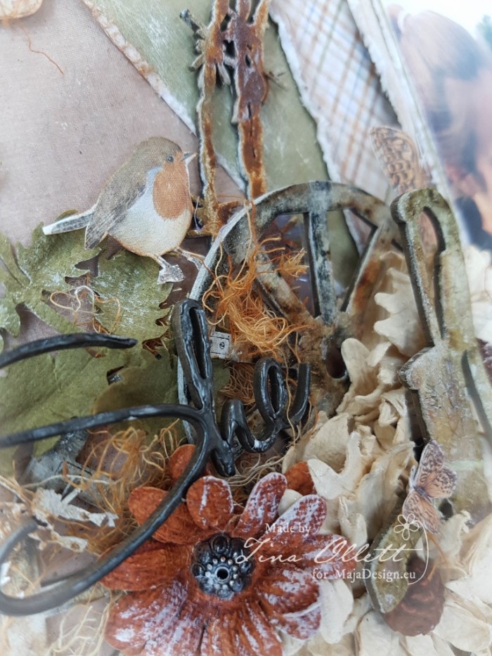
Again you can see the layering along with the added embellishments.

2017-04-25 She loves in Colour 028 (768x1024)

This little cute guy above was fussy cut from the Die Cut sheet. He is just too cute to leave out, don’t you think?

For my layout I have used the following papers from

Walking in the Forest :

The colours of fall ( a and b)

Die Cut Letters bs

and

Die Cut Sheet (a and b sides)

Well that is all from me today. I do hope you enjoyed your visit here! As I mentioned I have made a video to go with my post here. Just click on the link below to take you to it! Enjoy!!

Until next time happy crafting and take care.

Tina-sign

Dishcloths as Christmas Gift

1

Posted by Silje Kristin Aunan

6 November, 2016 -

Write a comment

Hello Everyone, I hope you have a great weekend 🙂

Today it is me, Silje Kristin, turn to inspire you with a project created with gorgeous paper from Maja Design. 

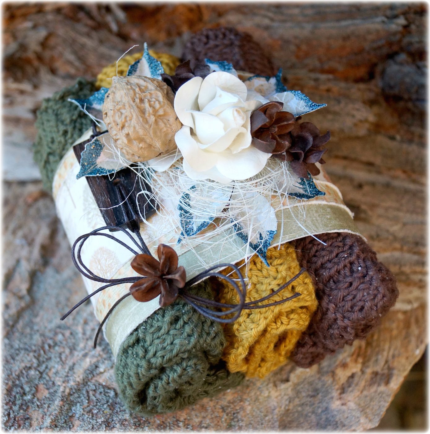
 In these days I am in full swing to create and arrange my Christmas  presents, which I will give to friends and family. One of the things I’m making is that I knit dishcloths in different patterns that I find on my own. The first three dishcloths I knitted was in gorgeous autumn colors, so I decided to create a cover that I can have around these cloths 🙂

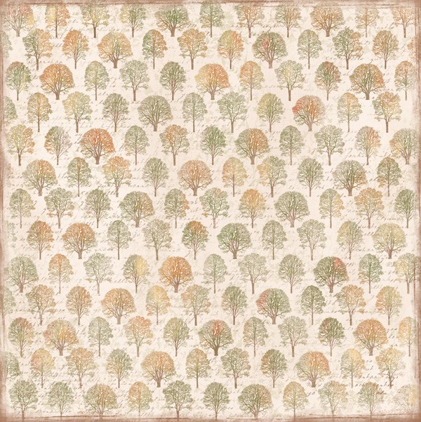
For this Christmas gift I have taken various paper from Maja Design collection Walking in the Forest. For me this was a natural choice, since the I knitted in autumn tones. I’ve used 3 different sheets: The Colours of Fall, Autumn in the Air and When Leaves are Falling.

What I’ve done is I’ve folded the cloths in the same size, then I cut up strips in the current pattern sheets and put them together on the back with double sided tape.

On the left side I have attached a brown button with wax thread, I have attached the thread with a bow. Atop of the bow I have attached something I do not quite know the name of.

Other details I have used is walnut, straws and brown and white flowers.

Under the flowers and the other details I have autumn leaves, which are punched out with a dies from one set of five autumn leaves. 

To break the traditional fall colors I have chosen to use one Embossing powders from Stampendous called Aged Marine.

If you have dishcloths as a Christmas present to someone, you can easily spice them up this way. In due so you do not have to pack the gift in, it’s going to fit perfectly under the Christmas tree with your own creativity <3

Should any of you wonder, my cloths are knitting with needles in sizes 4, between 55-60 stitches. The cloths are knitted with cotton yarn, until they are one square. 

Good luck 😉


SiljeKristin-sign

Walking in the forest ~ Baby ♥

6

Posted by Camilla Støen Bakke

13 January, 2013 - ,

Write a comment
A big welcome to the Maja blog today!
It is my first time this year, and I am really in for surprising you!;)
With a layout (which I never make), and the news about an expecting baby ♥
016
My husband and I are so excited and happy about the fantastic news!!
And when Jenny (CT coordinator in Maja Design) asked if I would consider to try to make a layout, I thought about it, and why not make the first page in the baby’s album, with it’s first photo taken;) In the ultrasound picture taken just before Christmas it is almost 11 weeks, and you can barely see it is a human beeing. But it is, and it really feels like a miracle!
021
I know I must practice some (a lot) more making layouts,
so bare with me that this is not something I usually do!
024
I have used the gorgeous autumn papers from Maja Design
and the collection Walking it the Forest.
♥♥♥
042
The letters “baby” are made with Tim Holtz XL Alphabet die – Word Play.
035
For the letters “i magen” I have used Tim Holtz – Typeset Alphabet.
The letters are inked with Walnut Stain and I have also added Crackle Accents to them.
Behind the letters I have painted with Crackle Paint – Picket Fence.
The gorgeous “Baby”-sentiment is from Stempelglede, and a collection called Velkommen lille Venn.
048 054
The other decoration stamps I have used are also from Stempelglede
and the collection Vintage Garden.
019
I have also coloured up two images from the wonderful Magnolia stamps. The first one is Bonny Tildafrom the With Love collection 2013. She is here to look after the baby:)
018
The other is Mother to be Tilda from the Princes and Princesses Collection 2012. And she symbolizes, who do you think?? Yes, me!:)
010
♥♥♥
Thank you so much for looking! And remember to be back often to look at the gorgeous creations made with the wonderful Maja Design papers.
Have a lovely Sunday ♥