Beautiful Memory– Layout by Keren Tamir

0

Posted by Keren Tamir

22 October, 2017 - ,

Write a comment

Hi Everyone,

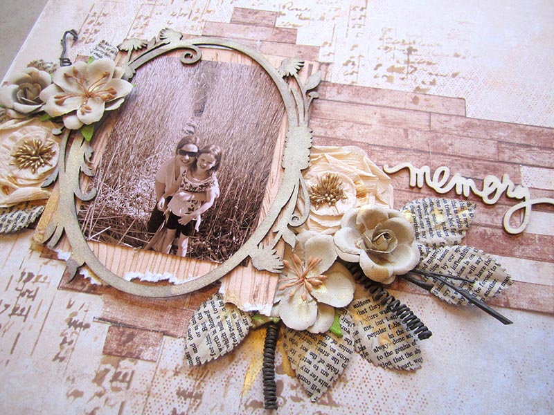
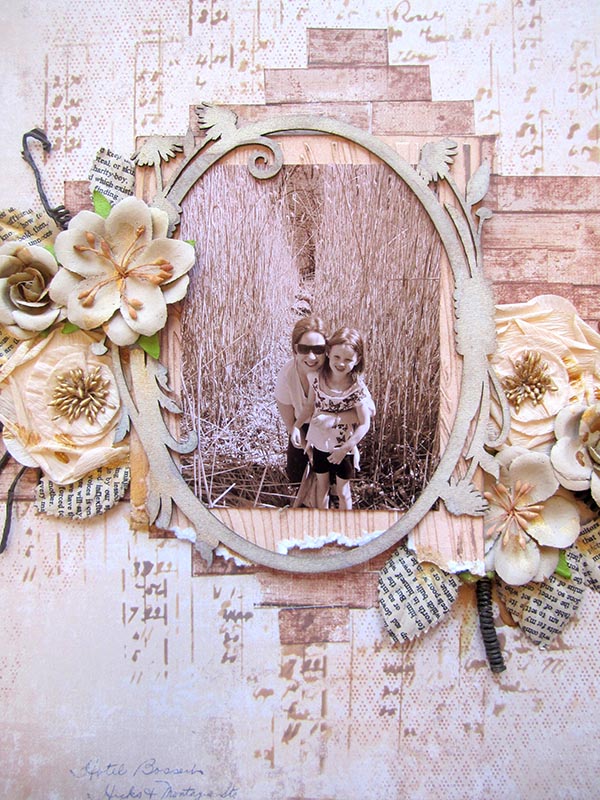
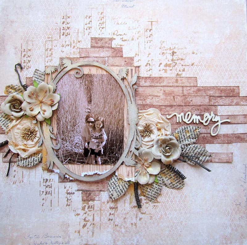
Its Keren here and I created a new layout for Maja Design using the new Denim & Friends collection. I used the “Wood and Summer Shirt” papers  for the layout as they’re very light and match the colors of the picture.

IMG_4218 copy

I cut the “Wood” paper to make it look as cut planks. I wanted to use it to create a wooden texture in the background.

IMG_4217 copy

I used chipboard and flowers to embellish the layout.

IMG_4221 copy


Here are the papers I used from the Denim & Friends collection:

904-Summer-shirt-bs Wood

Thank you so much for visiting the Maja Design blog

Have a wonderful day!!

Keren-sign

mm

Keren Tamir

I'm Keren Tamir a self taught scrapbooker, mixed media artist and designer. Since I was a child, I always loved art. I used to doodle on my notebooks and on anything I could get my hands on. ​ Fourteen years ago I discovered scrapbooking and fell in love with it. One of the main reasons I started scrapbooking was to preserve memories and photos for my children. Scrapbooking opened a creative door to something that I had longtime forgotten I'd loved. It gave me peace of heart and mind. visit my blog for more inspiration: https://kerentamir.blogspot.ca

Best Friends by Tina Ollett

2

Posted by Tina Ollett

29 August, 2017 -

Write a comment


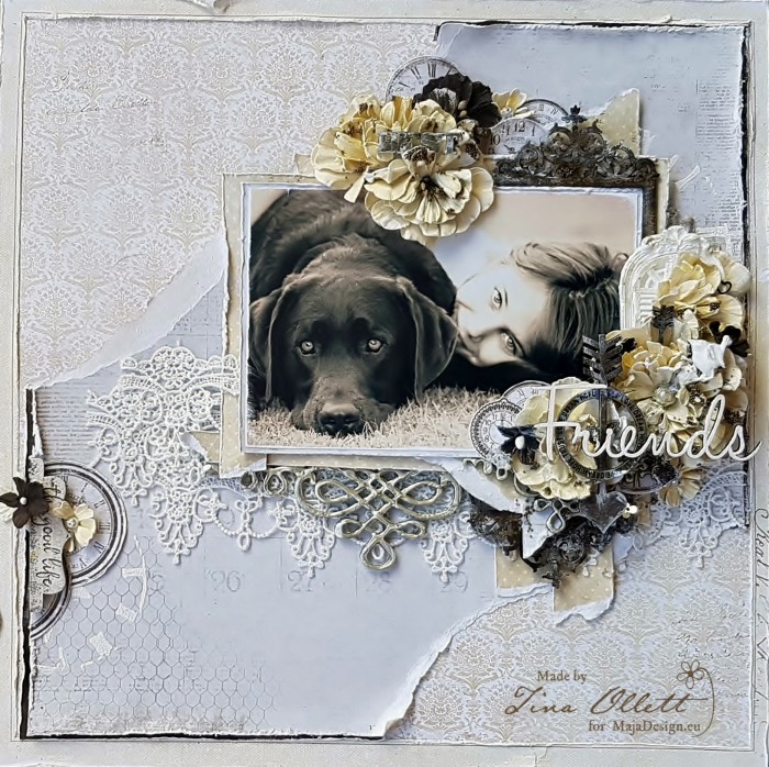
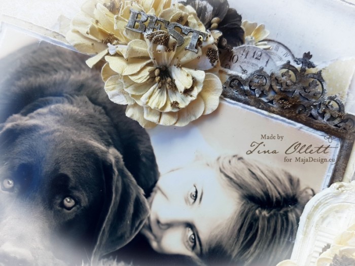
Hello and a huge welcome to you! Today I am here to share my next project which I created using Maja’s gorgeous Vintage Spring Basics combined with Coffee in the Arbour. If you keep scrolling I will share a few close-ups and more details of how I used these beautiful papers.

2017-08-21 Best Friend 020

“Best Friends”

I love yellows…….. and browns just seems to be the thing I go to next! So for this creation I came across this photo of my gorgeous youngest daughter and our furbaby Rafael some time ago in the back yard at home. It was one of those lucky shots that it was fortunate that they were looking my way at the correct time. I had printed this photo off a few times and I never liked the way this came out in the sepia tone so I had stashed it away. But for these project the colours fit beautifully, wouldn’t you agree?

2017-08-21 Best Friend 006 (600x800)

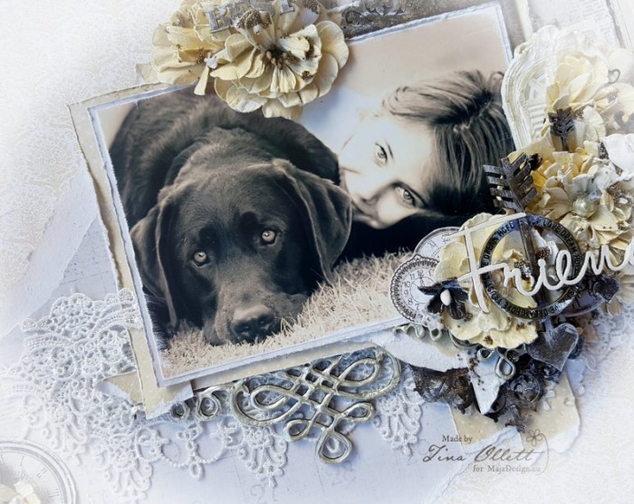
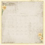
With papers tearing seems to be a natural progession. My first sheet (background sheet) was  Coffee in the Arbour’s Lemoncurd. The soft tones to this paper drew me to it instantly. I did a little stenciling on it but mainly left it’s beauty remain. I then cut the frame from the Vintage Spring Basics 1st of March Sheet. Did some distressing and adhered it to the background piece. With the remainder of the 1st of March I did some tearing and adhered the torn middle section to the page.  I love the images of the calender and other elements that are this sheet. They are just gorgeous and really lend itself to my project!

2017-08-21 Best Friend 026 (800x635)

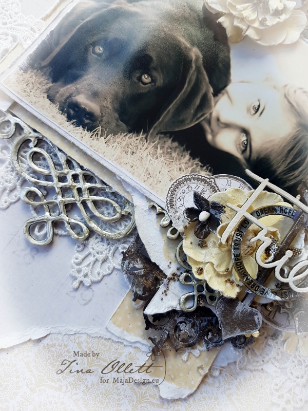
I also used the back of 1st of March to help the photo pop a little. Again tearing papers to fit the matting of my photo. The other torn pieces were layered amoungst the chipboards and flowers and clocks that I cut from from the Vintage Autumn Basics No.XVI. These were cut carefully and sanded and distressed to give that worn feeling.

2017-08-21 Best Friend 009 - Copy (800x600)

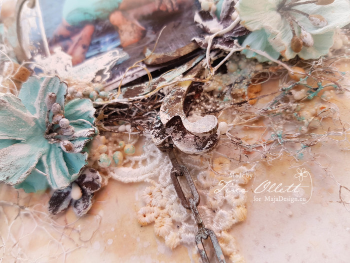
I used some Dusty Attic chipboards inked with Distress Inks and also some paper moulds that I made a few weeks back along with a charm that I picked up in my travels to Taiwan a few months back. I love the simplicity of it.  When everything was layered I then dry brushed my elements to soften the page and then added in a few microbeads with some 3D Gel.

Materials Used

Vintage-Spring-Basics-P

590-1th-of-March

Maja Design Vintage Spring Basics 1st of March

590-1th-of-March-BS

Maja Design Vintage Spring Basics 1st of March bs

Coffe-in-the-Arbour-P

688-Homemade-lemoncurd

Homemade Lemoncurd

692-Smell-of-coffee-bs

Smell of Coffee bs

Autumn-Basics-P

639-Vintage-Autumn-Basics-no.XVI_

No.XVI

Well that is all from me today. I so hope you have enjoyed my project today. I will see you back here in a couple of weeks! Until then take care and happy scrapping. xoTina-sign

Little Angel

1

Posted by Maja Nowak

16 August, 2017 - , ,

Write a comment

Good morning, Maja friends, welcome to the blog 🙂

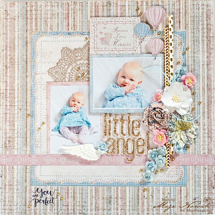
Today I have a sweet baby layout to share with you:

mdangel

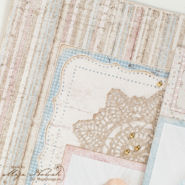
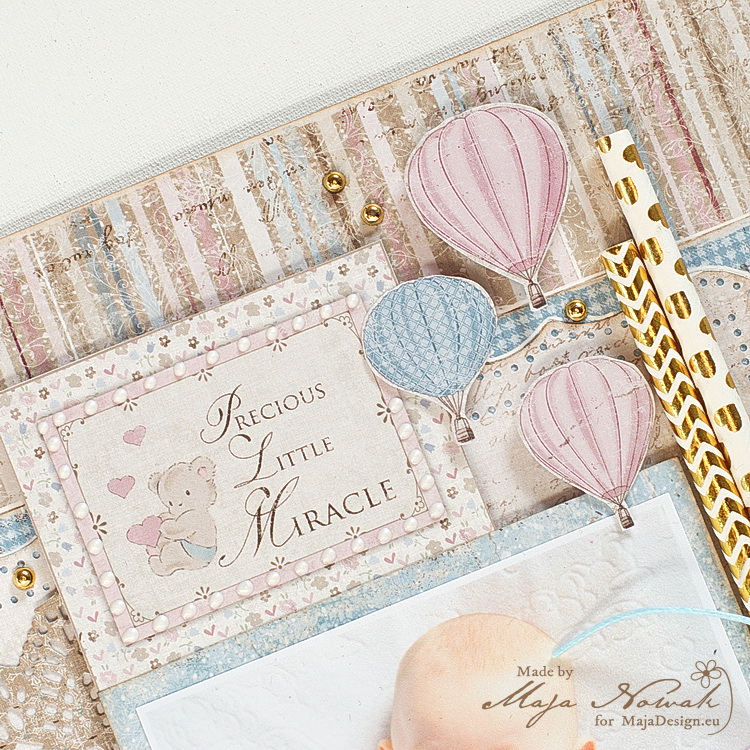
I combined the Vintage Frost and Vintage baby collections to create a delicate girly layout with my sweet niece. I created a layered background placing a square in the centre of the striped paper and adding a punched decorative square on top. Then I added a die-cut doily as a decorative corner between the photos:

mdangel1

I matted the photos with papers and tags from the Ephemera sheet, and then adde a couple of balloons I cut out from the New Arrival paper:

mdangel2

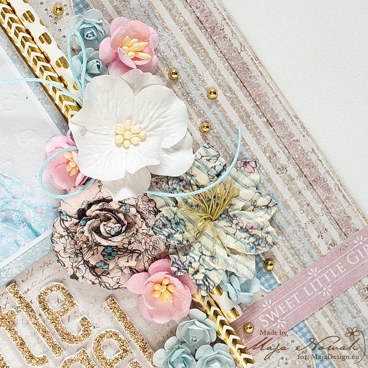
The flower cluster includes paper straws with metallic foil patterns and gold metallic drops:

mdangel3

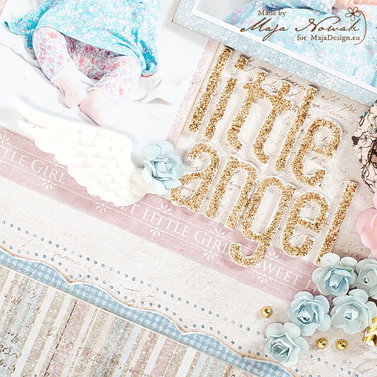
I made the title with foam sticker letters, embellishing the letter “a” with a molded angel wing and added a signature strip from one of the papers as a decorative border:

mdangel4

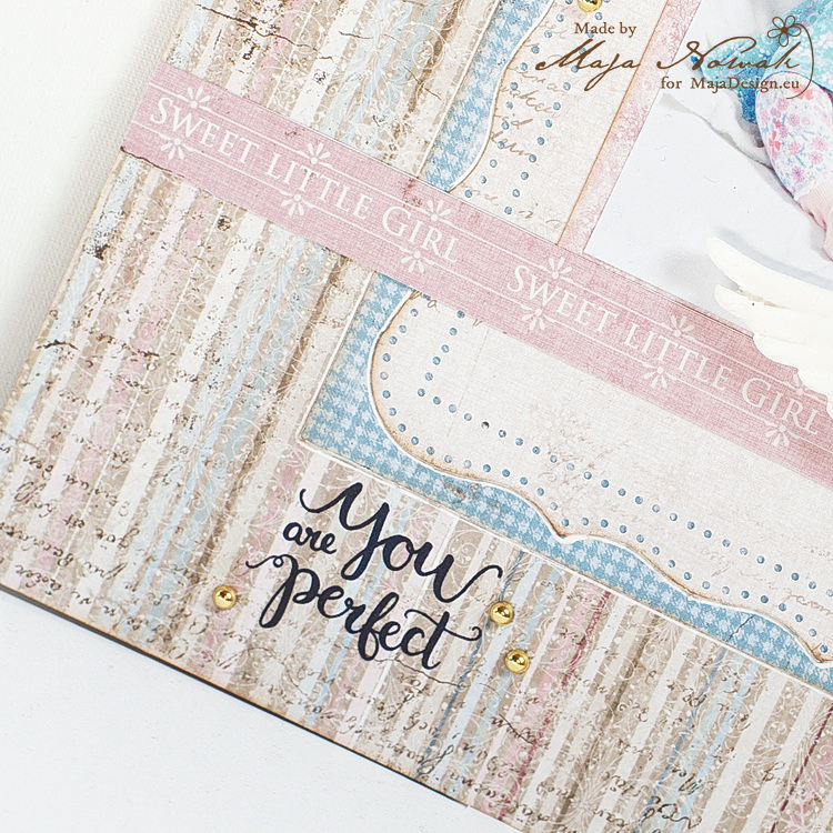
As a cherry on top, I stamped “You are perfect” in the lower corner.

mdangel5

I really love how the papers and patterns compliment the cute photos of the baby girl 🙂 What do you think?

And here’s the list of supplies:

Maja Design papers:

Other: letters: American Crafts; flowers: Prima, Wild Orchid Crafts, my stash; die: Prima; punch: Martha Stewart, mold: Prosvet; stam: ScrapBerry’s; paper straws, gold drops: mys stash.


See you later!

Maja-sign

Zapisz

“Picture Perfect” by Tina Ollett

1

Posted by Tina Ollett

1 August, 2017 - ,

Write a comment

Hello and welcome. Tina O back with you today.

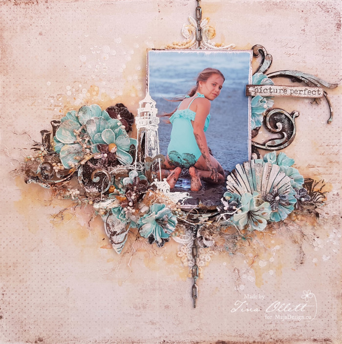
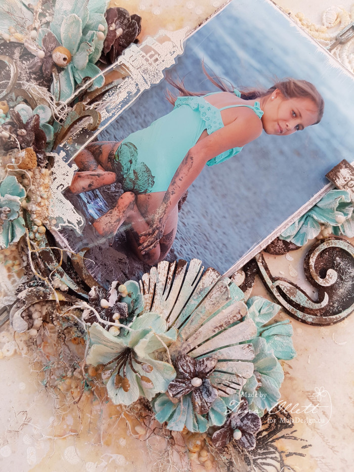
My newest creation, “Picture Perfect” has been designed using the gorgeous Denim and Friends collection. This is such a versatile collection that I decided to do a beachside layout. My favourite thing to create, as we live in one of the most beautiful beach inspired places in the world ! Much of our spare time and holidays are spent at the beachside, therefore I have an endless supply of photographs from these memorable moments.

2017-08-01 Picture Perfect 026

Denim-P

Mono-Denim-P

I have kept my layout very simple using a smaller sized portrait colour photo of my youngest daughter at the beach getting very very muddy. I caught her unawares as you can see from the photo. Denim and Friends has many gorgeously stunning pages that would work perfectly for a beachside background page. Today I decided to use the bs of Fashion to start my layout. I primed it with gesso and did some stenciling using the Dusty Attic Confetti stencil with crackle texture paste. Once it dried a did some colouring with Rusty Hinge Distress Ink and water.

2017-08-01 Picture Perfect 019 (800x600)

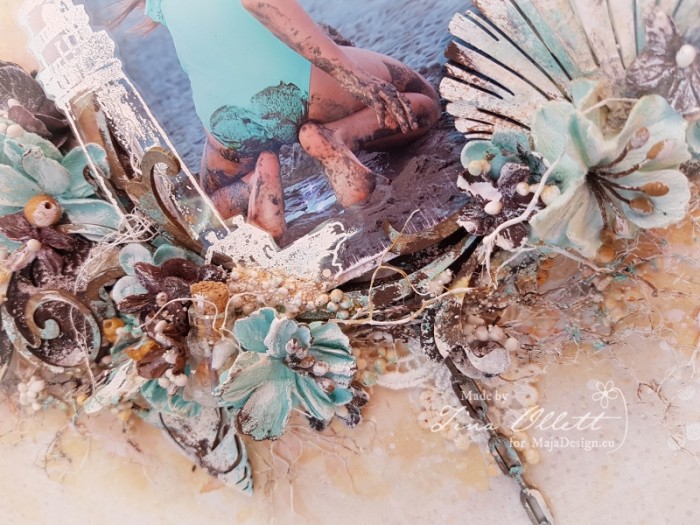
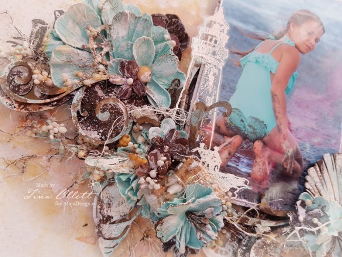
I did lots of layering of chipboards (Dusty Attic) to create a design to work a photo into. These chipboards were dressed in Rust Pastes, Gesso, Distress Inks and Nuvo Embellishment Mousse.

2017-08-01 Picture Perfect 016 (800x600)

I made some acetate embellishments using 49andMarket’s Sand and Sea stamp set. Other embellishments included a lace motif and beautiful 49andMarket Sea Side Blooms in Sea Breeze colour.

2017-08-01 Picture Perfect 017

I wanted to emulate the mud that my daughter was digging in. To do this I have used fibres coloured with rust pastes. I dried these and gave them a coating of gesso and then randomly wiped over with Rust Pastes. I also adhered over the fibres with some Art Stones with 3D Gloss Gel. And then coloured them using some Nuvo Mousse.

2017-08-01 Picture Perfect 023

Well that is all from me today. I hope you have enjoyed your visit here today.

Until next time happy scrapping. x

Tina-sign


When One Is Not Enough :)

4

Posted by Maja Nowak

5 July, 2017 - ,

Write a comment

Good morning to you, dear Visitors, welcome to the Maja Design blog!

Have you ordered our latest release, the Denim & Friends collection? If not, then hurry up, it’s simply gorgeous! One of my favourite collections so far! Sooo perfect for masculine projects!

And so, when I stopped smelling and touching 😉 , I began cutting and I can’t stop! And I created this layout:
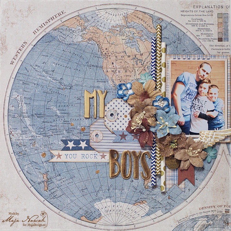
mdmboys1

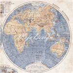
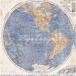
I took the beautiful hemisphere map for the background, matted my photo with various papers and added some paper straws for dimension:
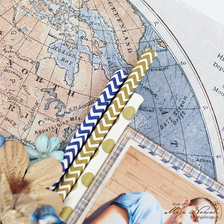
mdmboys3

…the flower cluster with a metal charm:
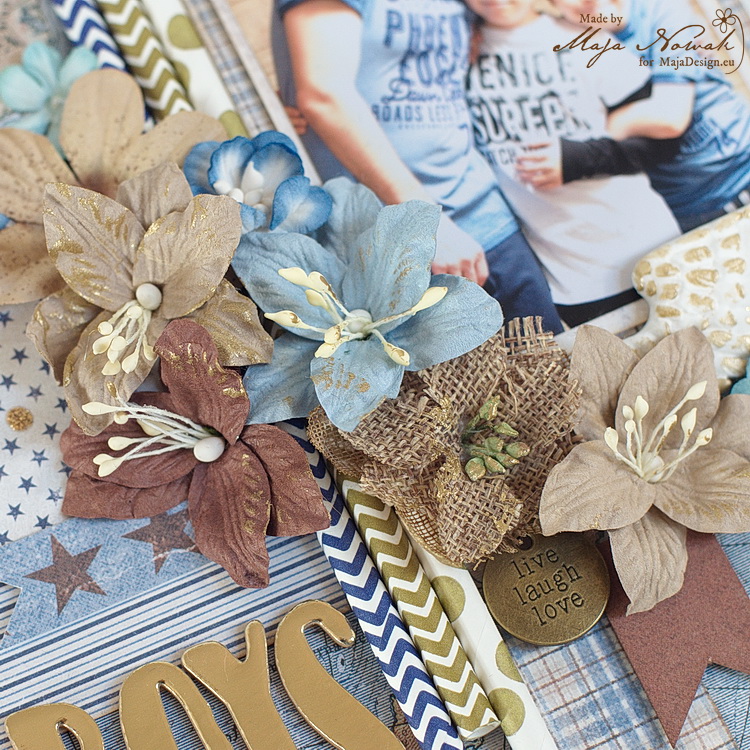
mdmboys4

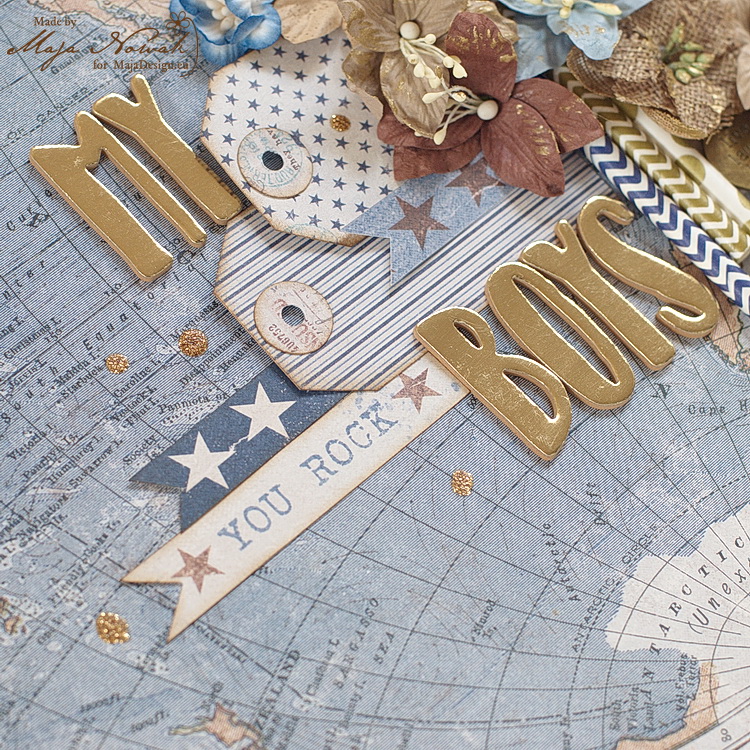
…and made my title using foam metallic gold sticker letters. I also hand-cut some tags and added pieces of signature strips from papers – I love including them in my projects 🙂
mdmboys5

I really like the way it turned out, but I had so much fun working with this collection I couldn’t just stop after one layout 😉 And so I made another one:
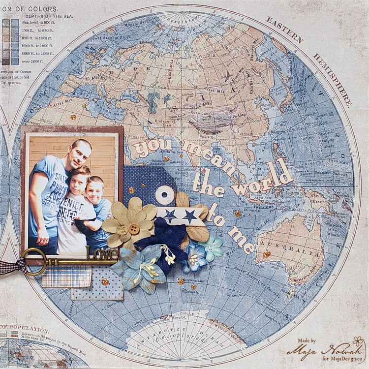
mdmboys2

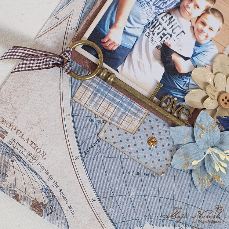
For a change, I used the other hemisphere for the background 😀 And started to embellish the photo. I had this “love key” for ages and finally the time has come to use it 🙂
mdmboys6

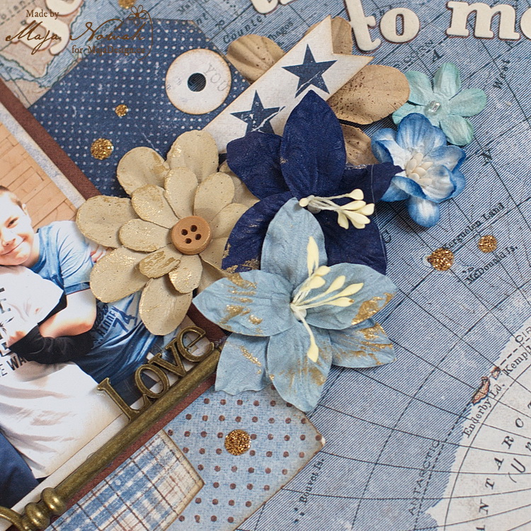
There’s also the flower cluster with tags and signature strips:
mdmboys7

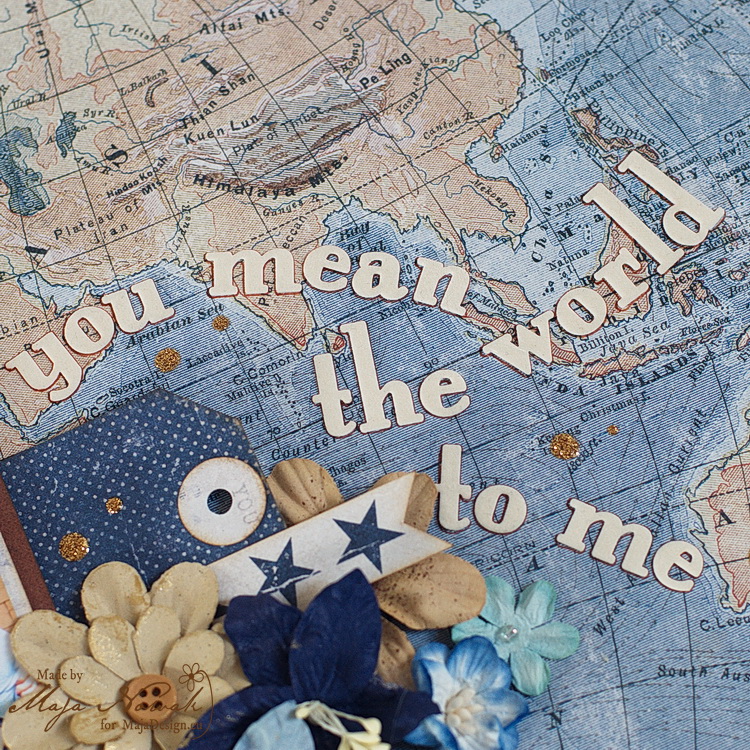
…and a somewhat longish title 😉 using foam letters. A tip for you: if you want your small letters pop out of the patterned background, trace them around with a fine pen 🙂
mdmboys8

It may be a little difficult to notice, as the two maps are on two sides of the same paper – but if you have two of them you’ll see the two hemispheres match perfectly! And soooo….I combined my two layouts to make my first double page ever! 🙂
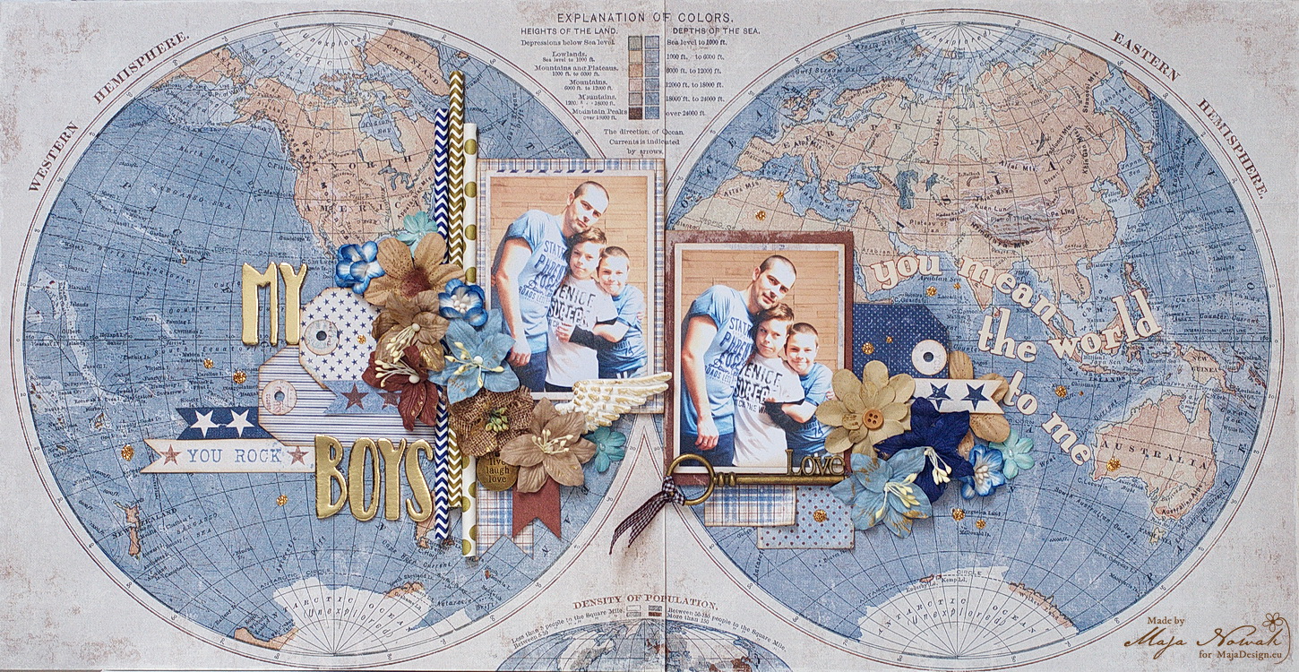
mdmboys

What do you think? I really like the way the two pages go together 🙂

And here’s what I used:

Maja Design papers:

Other: flowers: Prima, wild Orchid Crafts; letters: American Crafts, Prima; glitter ink: 13@rts; charms, paper straws: my stash


As I said, I can’t stop cutting these beautiful papers, so join me soon for more inspiration with Denim&Friends 🙂

Maja-sign