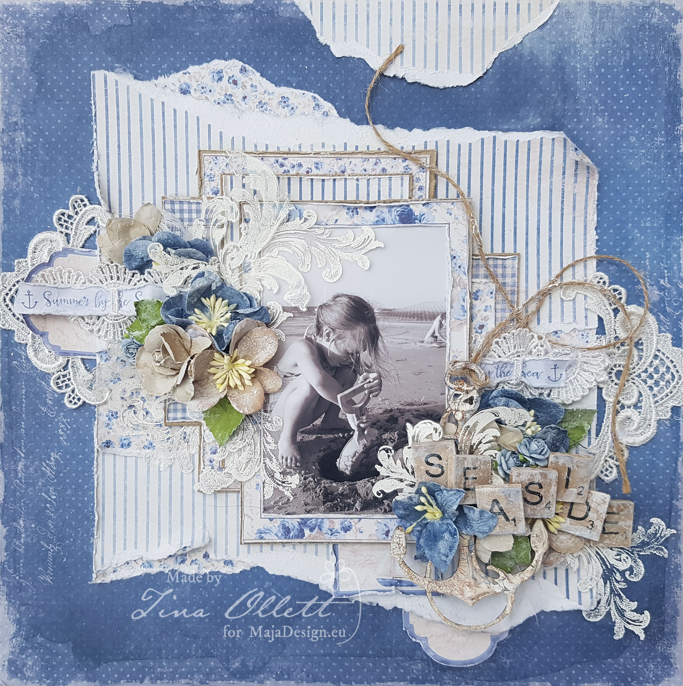
The life is full of colours. Find them all ! Card by Padoriaa

0

Posted by Paulina Monasterska-Tronina

9 March, 2017 - , ,

Write a comment

Hello our blog fans. Today I would like to present a card in a little bit different size than normal cause it is 20cmx14cm ! To create this project I used the newest collection ! Both – Sofiero and Monochromes mixed with Summertime.

Card XL

Card XL

The card is for a boy. The colours from the newest collections fit perfectly here cause it was needed to use green colour. I added many layers, flowers and chipboard.

Card XLCard XLEvery single time when I’m writing the new post you can read “I felt in love”. Nothing change this time ! I totally felt in love with the newest collections! I’m really glad to see the Monochromes ! Right now the only limit is your imagination ! 🙂

Sofiero-L Mono-Sofiero-L
Summertime-P1

Hugs, Paulina Padoriaa-sign

“Sunshine” by Tina Ollett

2

Posted by Tina Ollett

28 February, 2017 -

Write a comment

Hello and a very warm welcome to you. Thank you for joining me here today. I have my second Design Team layout for the month today and yet again I am using the gorgeously stunning Summertime collection. I am not usually into red but this has really got me working on it. I have simply titled this “Sunshine”, well because I live in a very warm climate, sunshine is what we see the most of and the day I took this photo of my littlelist it was exactly that …..Sunshine.

2017-02-28 Sunshine 069 (800x795)


This layout was very labor intensive for me. I had laid it all out and then of course changed my mind part way through and changed it all back around again. I have used Dusty Attic’s February Moodboard as inspiration for the starting point of my layout, that being the sketch in a sense.

2017-02-28 Sunshine 054 (800x611)

I kept my layout very clean without using too many mediums this time around. I have used Summertime’s “Light Scarlet” and “Is always the best, bs” alternately as background pieces. I hand cut a border into “Is always the best” and distressed a lot of the sections that I wanted the “Light Scarlet” to show through. I have also used only one sheet of the “Light Scarlet” but gutting the centre section and cutting banners from the middle section for the inserts of my Die Cut cards.

2017-02-28 Sunshine 034 (600x800)

Summertime-P

“Smell the Roses” would have to be my favourite piece from this collection along with the Garden Diecuts and the Polka Dots, oh heck the whole lot really is a favourite with me. I truly could keep using this collection over and over again.

2017-02-28 Sunshine 038 (600x800)

As you can see above, I have used the strip from the base of “Light Scarlet” and a banner running through the middle of my layout. They are really gorgeous the strips………I never ever throw mine away. Always perfect for a title or just a little subheading tucked in a flower cluster.

2017-02-28 Sunshine 058

And speaking of flowers, well I have used some……well a lot, along with some gorgeous velvet leaves from Green Tara and some miscellaneous rose buds on long stems which I just adore. I embellished the remainder of my layout using Dusty Attic chipboards. They were dressed in Liquid Pearls and gesso. I have also scattered in some seed beads for good measure and a little cheesecloth to soften the layout a little further. Well that is it from me today. I so hope I have inspired you in some way to get out those summer photos and scrap the special memories behind them. Until next time take care and happy scrapping. Tina-sign

Other Materials Used

Dusty Attic Decorative Frame #2

Dusty Attic Scroll Set #1

Dusty Attic Wordplay 2

Liquid Pearls Chocolate

Distress Ink Walnut Stain

49 and Market Gabi’s Postcard from Paris Set

Miscellaneous Carte Postale Stamp

Clear Seed Beads

White Gesso

Lace Trim

Muslin

Petaloo Vintage Velvet Dogwood Red

Petaloo Botanicals White

Long Stemmed Rose Buds

“Seaside” by Tina Ollett

8

Posted by Tina Ollett

25 October, 2016 -

Write a comment

Hello and a very warm welcome to Maja Design.

It is Tina here with you today to share my next layout. I have been playing with the “Summertime” collection which I have fallen madly in love with, so don’t be surprised if you see me using this again and again!

I have titled this ….“Seaside”…..

2016-10-24 Seaside 015

I found this photo of my youngest a few weeks back and put it to the side and it wasn’t until I pulled it out again that I noticed my eldest daughter was also in the picture in the background ……so I just had to use it! I have kept the layout soft and softened it more by tearing the “Cute Summer Dress” a and b sides allowing the core to show through., They have been layered up with a little Kraft Cardstock. I have also cut the frames from “By the Sea” a side and reversed some to show the b side. I also saved the strip from the paper to thread through the lace at the left and right of the layout. You can see this below.

2016-10-24 Seaside 023

I love nothing better than to do a little op shopping to find odd bits and pieces to add to my layouts. And this is where the scrabble pieces come from. I made them a little shabbier by added a dry brush of gesso to them and then layered them up through the middle of my flower cluster and large anchor at the right of the layout.

Above and below are a few more close-ups for you. I had thought I was finished and took photos went to bed and come back the next day to find that I thought it needed a little more, so I then made some flourish transparencies using a stamp and Seafoam embossing powders. I fussy cut these and cut them down smaller to add around my layout.

Summertime-P

Below are the papers that I have used from the Summertime collection to complete my layout.

You can see the Dusty Attic chipboard anchor below. It was dressed with a little Crackle Paste and then I rubbed in some Distress Ink and wiped it over with a little Glimmer Paint.

2016-10-24 Seaside 025

Other Products Used

Kraft Cardstock, Acetate

Flowers – 49andMarket, Prima and Miscellaneous

Chipboard – Dusty Attic

Scrabble Pieces

Leaves – Kaisercraft

Lace, Lace Motifs, Muslin, Jute

Gesso, Finnibair Crackle Paste, Walnut Stain Distress Ink, Glimmer Paint, Seafoam Embossing Powder, Versa Mark Ink.

That is all for me today. I hope you have a most beautiful week and I will see you back here again very soon.

Happy Scrapping !xo

Tina-sign-250x33

“My little mockingbird”

1

Posted by Camilla Støen Bakke

5 October, 2016 -

Write a comment

IMG_4830

Hi all wonderful Maja-fans!  I went to a birthday party last weekend, and can you belive…?? The lady of honor became 95 years old. An she is still living in her own house. I wanted to make her a nice card, and here it is. I have used three pattern papers from the gorgeous collecton Summertime.

Summertime-P

I have tried to paint the image in the same colours as in the papers. The image is from Stempelglede and the collection Vintage garden. I have coloured it with Distress Ink, re-inkers. For the red colour I have used Fired Brick, Aged Mahogany and Black Soot. I have also added Crackle Accents on some of the flowers.

IMG_4841

The small flowers are punched out from a Retro flower punch, small. I have inked the edges with Distress pad, Walnut Stain. and added Stickles, Star Dust. In the middel I have added Licquid pearls.

IMG_4855

From another angle.

IMG_4805

The numbers are cut out from a Sizzix die, and I have added Fran-tage, Shabby White. I have also added Fran-tage around the image, on the edges.

IMG_4817

Some birthday tags and the tassels made with  Magnolia DooHickey dies (vol 5).

IMG_4818

I have put some Sisal grass behind the flowers.

IMG_4836

Here comes the list of the gorgeous papers used:

Thank you so much for visiting the Maja Design Blog!

Hugs,

Camilla

Lollipop Cards in the end of Summertime

1

Posted by Silje Kristin Aunan

8 September, 2016 -

Write a comment

Hello Everyone 🙂

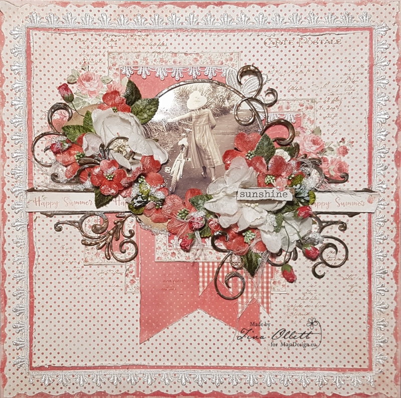
Today it’s Thursday and I am ready with a new project for Maja Design. I must admit that I’m not quite finished with the summer, even if it rains all day long, the forest begins to change colors and the temperature drops, you se I want to keep the summer a little longer, least in my projects.

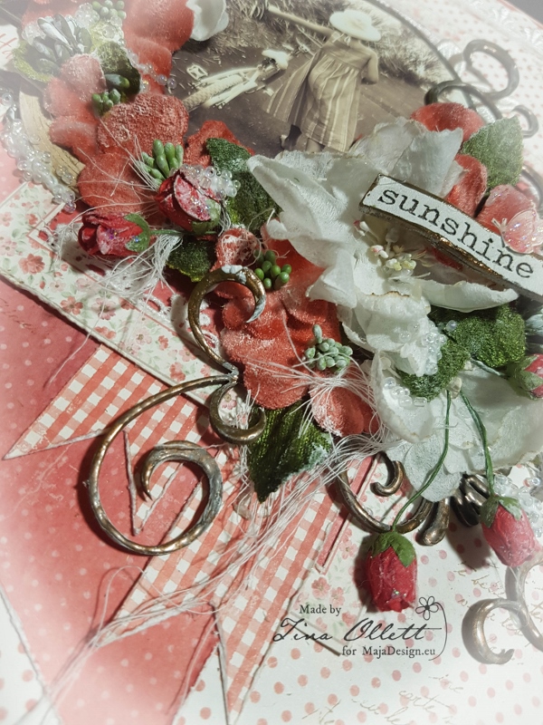
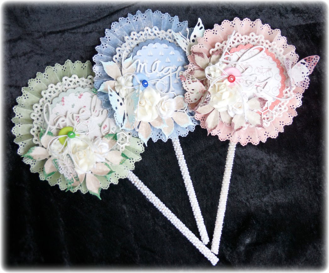
Today I have 3 Lollipop cards I want to show you, considering that this is the first time I’ve made ​​lollipop cards, I like them alot. All the cards are made in ​​the same way, with the same details, but what separates them is the colors of the pattern papers, the embossing powder and the dieses I’ve used.

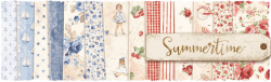
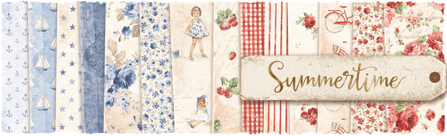
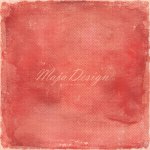
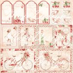
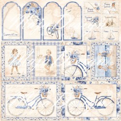
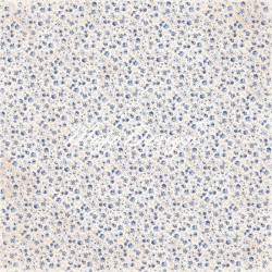
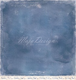
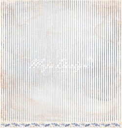
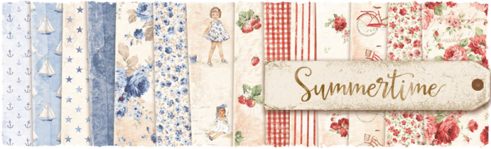
I have used the pattern sheets from the latest collection called Summertime.

To the card in blue, I’ve used these  paper sheets: It’s My Favourite, Gives Me Joy, Cute Summer Dress, Glittering Water, Watch the Boats and Having Fun.

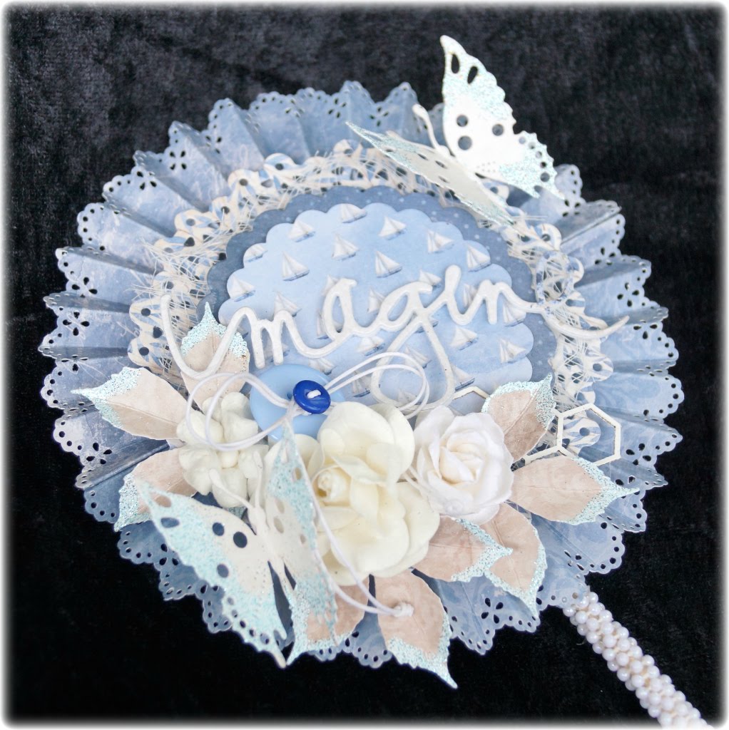
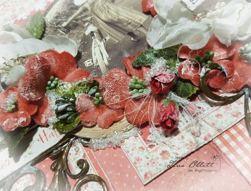
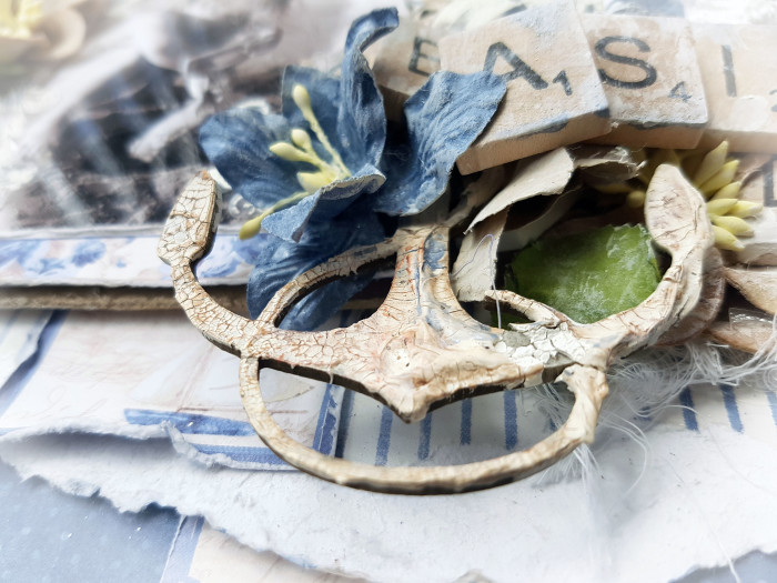
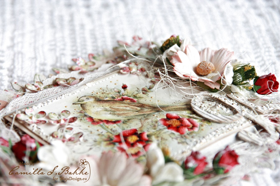
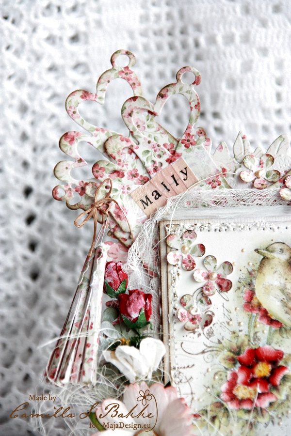
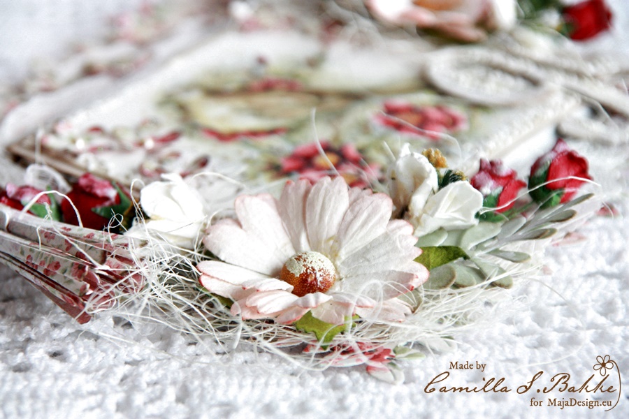
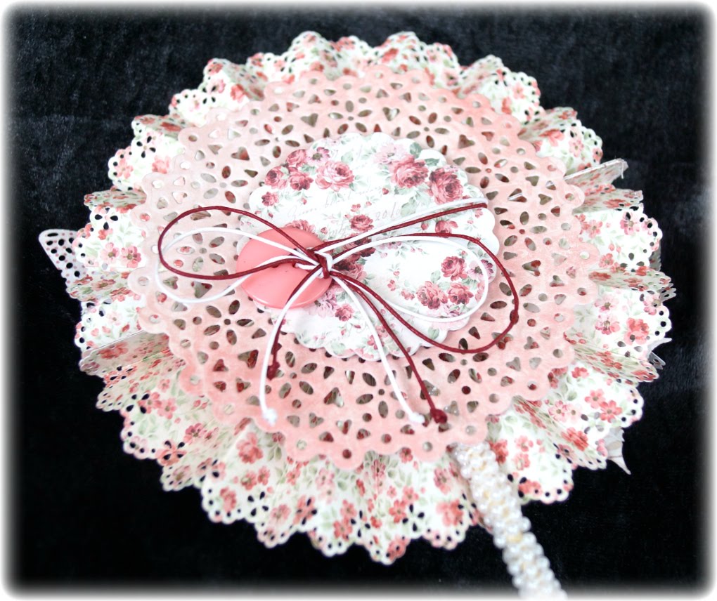
The edge of the cards is made with a punch from Martha Stewart, on top of the first layer I have several layers of patterned paper in different sizes and also spent some cheese cloth.

Under the white flowers, I have some leaves that I have embossed with Shabby Blue, a powder from Stampendous. The butterflies are a die from BoBunny, here the wings are embossed with the same powder as the leaves. Also under the flowers I have some wood from Wycinanka which is embossed with white powder from Ranger. In between all the flowers I have a light blue button with a bow and on top of it, I have a small navy button. Over the card I have one die from Heidi Swapp with the word Imagine.

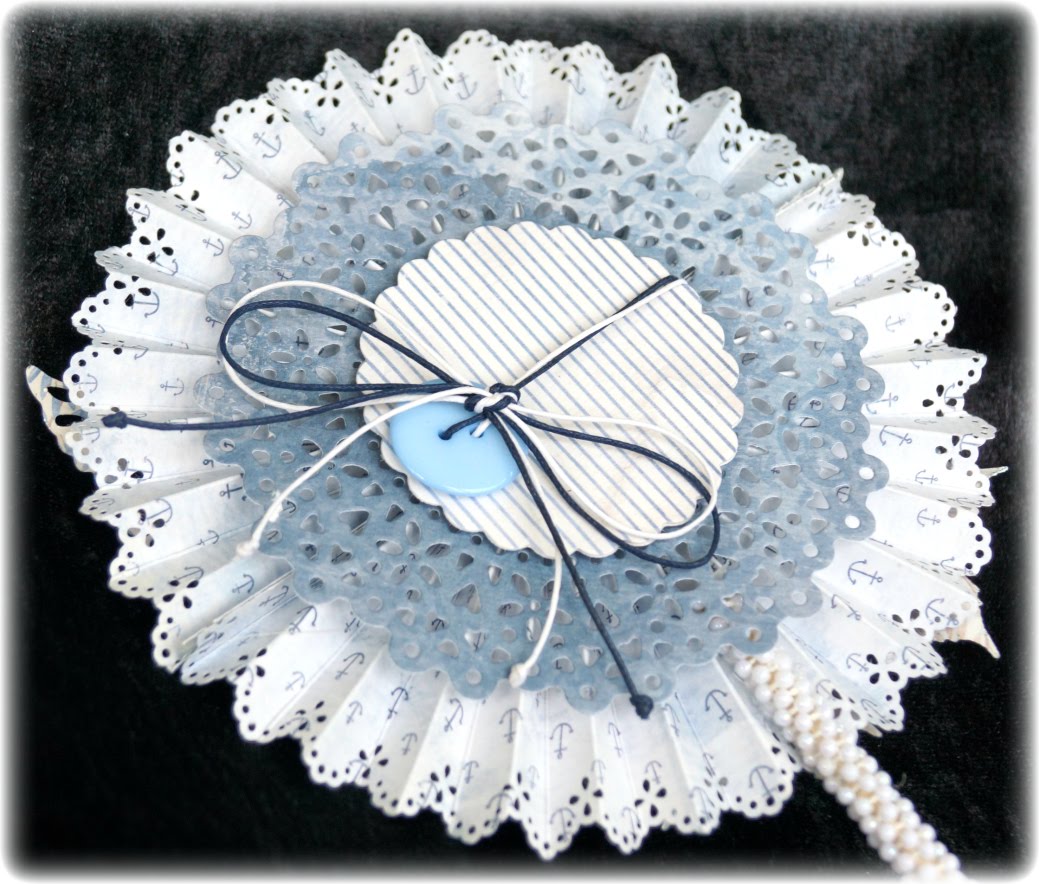
When you turn the card, you can se that the card have a simple backside. If you Open the bow you can writing a greeting inside the smallest circle.

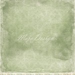
The second card is the card in green. I have used these sheets from the Summertime collection: Greenery, Taste the Strawberries and Is Always the Best.

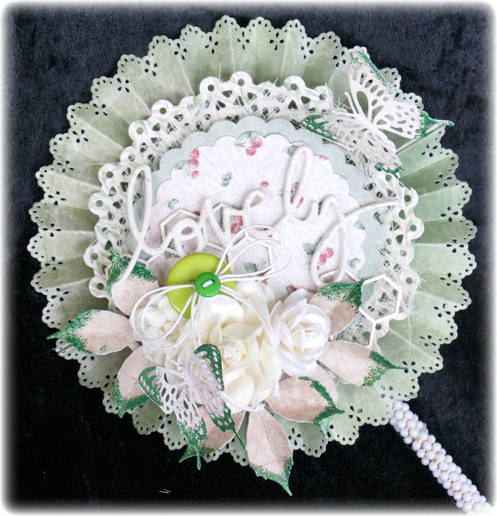
This card has as many layers as the card in blue.  Word Lovely is also one dies from Heidi Swapp and the buttons have been replaced by someone in green tones.

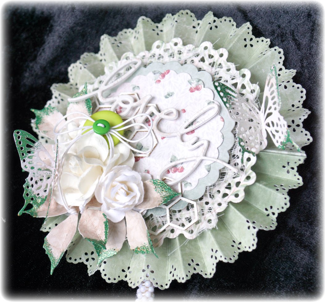
Here are the leaves under the flowers embossing with Aged Hunter, one powder from Stampendous. The butterflies are embossed with the same green powder and comes from one set of three butterflies from BoBunny.

If you flip the card, you se a new bow that you can open for writing a greeting.

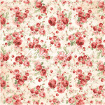
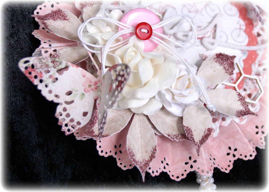
The last card is in red and since the colour was red, then I just need to use the word Bliss, this is also one dies from Heidi Swapp. The sheets I have used are called:  Is Always the Best, Smell the Roses, Flowers Everywhere, Let’s go for a Ride and Ligth Scarlet.

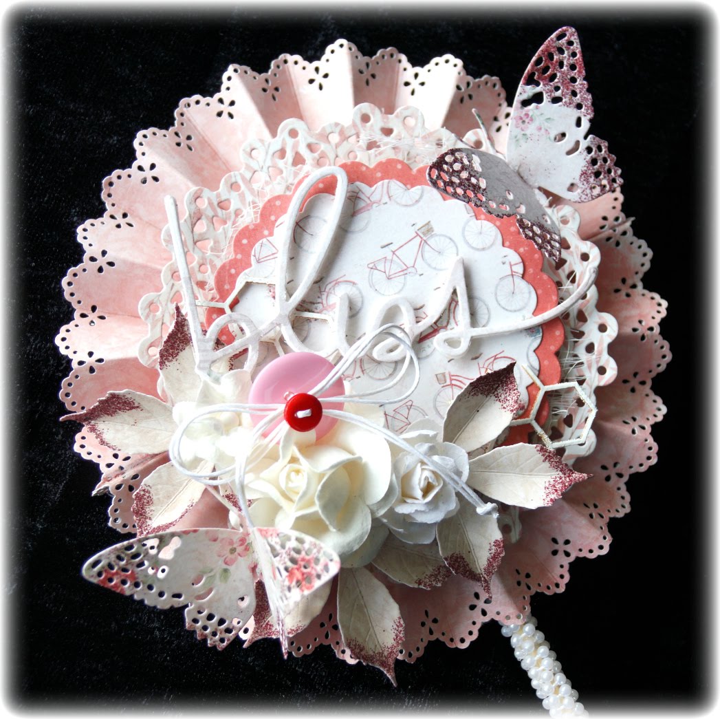
The leaves and the butterflies is embossed with a powder of Distress Ink I do not remember the name of. The buttons on this card is in red and a big one in pink.

The back is exactly the same as on the other cards.

Placing all the Lollipop cards together, you get a nice symphony of summer cards. Now you see way I want to keep the summer a little longer 😉
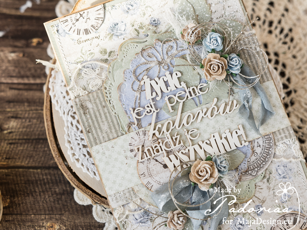
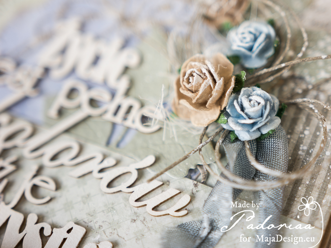
SiljeKristin-sign