Good morning, dear Maja Friends, welcome to the blog today 🙂
As I think it’s quite beneficial for both personal and creative development, from time to time I decide to step outside my comfort zone and try something I haven’t tried yet or I don’t like. And today I bring you the result for the latter: a layout featuring my not-so-favourite colour palette of orange paired with purple.
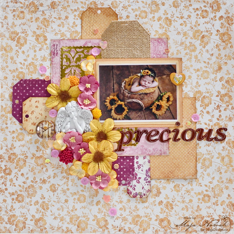
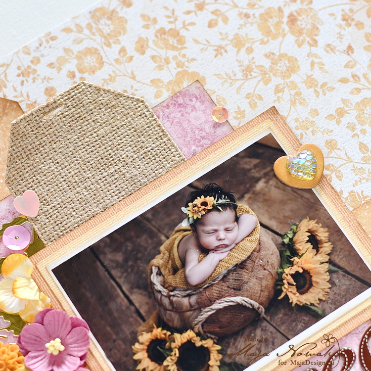
For this self-challenge I used a photo of my goddaughter taken soon after she was born. I used the Little Street Cafe collection that offers some beautiful orange patterns and eased the pain with a bit of purple and kraft brown. The photo has a rustic feel, so I added a tag cut out of burlap paper, but added a gold filigree panel to relate to the title too 🙂
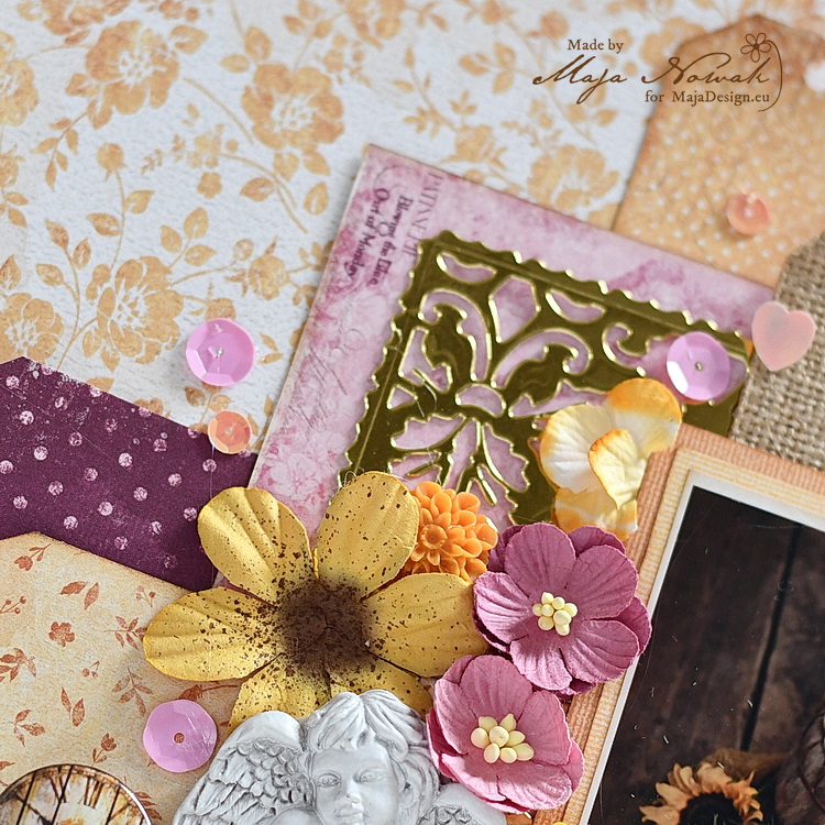
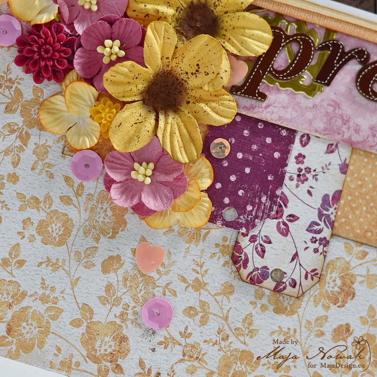
I also added a couple more of tags and a lot of flowers to decorate the photo, as well as a guardian angel to protect the baby 🙂
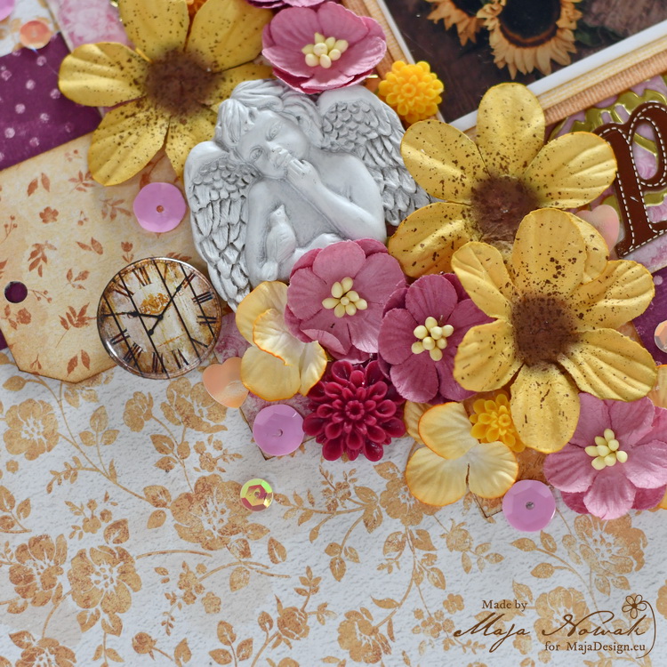
The title is arranged with cardboard letters that together with a clock button add to the rustic climate:
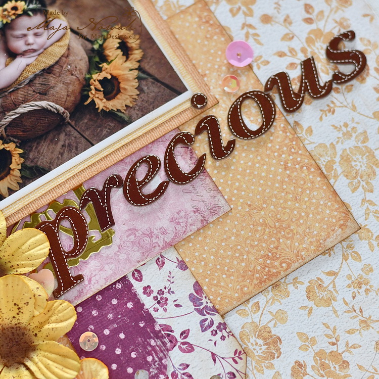
Apart from the gold panel, there are some opalescent sequins to add glam on the other hand:
Although it’s not my colour combo of voluntary choice, I still like the way the page turned out. What do you think?
Here’s what I used:
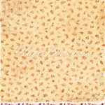
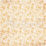
Maja Design papers:
-

- Sunshine
-
- Sunshine-bs
-
- Feeling good
-

- The best place
-
- The best place-bs
-

- Honey
-

- Honey-bs
Other: dies: Cherry Lynn Designs, Crea-Lies; flowers: Prima, Wild Orchid Crafts; button: Fabrika Dekoru; resin angel: Prima; sequins: my stash.
Do you leave your comfort zone sometimes? Do you like the results? Tell me in the comments!

3 Comments
You sure did an awesome job on this page. I must confess, it´s normally NOT my colorchoise either, and I actually don´t think. I´ve ever made anything with a strong orange or dark purple at all ha ha, but I have used bright shades of the colors thoug, but then it´s all over in the peach color more than orange he he.
But must admit, I like this more than I would´ve believed before I saw it ha ha, so guess we can change our minds some times on colors too. The set up on the layout on the other hand is just perfect and makes an impressive look to the adorable picture. I actually love it.
Have a wonderful day everyone and stay safe.
Thank you so much Maryann, I love reading your comments 🙂 It seems being “forced” to use colours we don’t like sometimes turns out to be actually pretty good! 🙂 Hugs to you!
It turned out beautifully I think, it’s not a color combo I would normally go for either, but in this case it matches the cute photo dry well. Good job.